Search results for

"slider"

Cómo Elegir un Tema de WordPress en 2025 (Sin Volverte Loco)

☑︎ Esta guía ha sido actualizada para 2025

Elegir un tema de WordPress puede sentirse como entrar a un gigantesco almacén con 50.000 atuendos… y ningún maniquí.

Todos prometen velocidad, belleza, SEO, polvo de unicornio — pero ¿cuál realmente te queda bien?

En esta guía, vamos a desglosar:

  • qué es un tema en realidad (pista: es mucho más que “colores y tipografías”)
  • si te conviene elegir un tema gratuito o de pago
  • y las 8 cosas clave que deberías tener en cuenta al escoger el tema adecuado para tu web

Ya sea que estés lanzando un blog, creando un portafolio o renovando la página de tu empresa, esta guía te ayudará a evitar temas pesados, arrepentimientos estéticos y pesadillas con el soporte técnico — para que puedas concentrarte en hacer crecer tu sitio, no en criarlo como si fuera un Tamagotchi.

Vamos desde el principio:

¿Qué es un tema de WordPress?

Empecemos aclarando una confusión bastante común: un tema de WordPress no es solo cómo se ve tu sitio.

Es el motor visual completo detrás de tu web: distribución, tipografías, paleta de colores, estilo de navegación, formas de los botones, diseño del blog, adaptación a móviles… todo eso y más.

En términos técnicos, un tema está compuesto por plantillas, hojas de estilo y a veces un poco de JavaScript mágico que le indica a WordPress cómo mostrar tu contenido. Algunos temas son minimalistas; otros vienen cargados de demos, animaciones y plugins incluidos.

Pero aquí viene el truco:

No todos los temas son iguales — y además, están hechos para plataformas específicas. Un tema de Joomla no sirve para WordPress. Un diseño de Wix no se importa mágicamente a Drupal. Los temas están pensados para cada CMS.

Así que cuando hablamos de “tema de WordPress”, nos referimos a uno creado específicamente para WordPress. Y hay miles de ellos. Literalmente.

Lo que nos lleva al siguiente punto…

3 formas de diseñar una web (y por qué los temas ganan para la mayoría)

Supongamos que quieres lanzar un nuevo sitio web. A grandes rasgos, tienes tres opciones:

  1. Contratar a un diseñador + desarrollador 🧑‍💻 puede darte un sitio espectacular hecho a medida… si tienes varios miles de euros disponibles. Y aun así, no hay garantía de que sea fácil de mantener o actualizar, a menos que también presupuestes soporte continuo.
  2. Construirlo tú mismo desde cero 🔧 es genial si ya sabes HTML, CSS, JavaScript… y tienes el tiempo libre de un monje ermitaño. Si estás leyendo esta guía, probablemente tienes mejores cosas que hacer que depurar código a las 2 a.m.
  3. Usar WordPress + un tema 🎯 es el punto medio ideal para la mayoría: es rápido, asequible y se ve bien desde el primer momento.

¿Por qué los temas son el punto dulce?

  • Cuestan menos que una cena para dos — la mayoría de los temas premium rondan los $40–$80.
  • Están listos para usar — no necesitas diseñar cada página desde cero.
  • Muchos incluyen diseños prediseñados, contenido demo y plugins integrados (como sliders, formularios de contacto o constructores visuales como Elementor).
  • Los mejores temas están bien documentados e incluso incluyen soporte de los desarrolladores.
  • Puedes lanzar tu web en un fin de semana — y aún te queda tiempo para Netflix.

¿No sabes qué tema está usando un sitio que te gusta? Prueba nuestro detector gratuito de temas WordPress 🔍

…Muy bien, ya vimos por qué los temas son un atajo inteligente. Ahora hablemos de cómo elegir uno bueno.

Checklist: Qué buscar en un tema de WordPress

Hay literalmente miles de temas para WordPress — y la mayoría se ven geniales en la demo.

Peeeero… las apariencias engañan 😬

Aquí tienes una checklist honesta para ayudarte a evitar temas hinchados, rotos o simplemente malos:

✅ ¿Quién lo creó?

Quédate con proveedores de confianza — los que llevan tiempo en el mercado, tienen buenas reseñas y actualizan sus productos.

Recomendamos empezar con:

Estos marketplaces son altamente competitivos — lo que significa que los desarrolladores tienen todas las razones del mundo para mantener su código limpio, seguro y actualizado.

✅ ¿Se ve moderno?

El buen diseño evoluciona. Evita cualquier cosa que parezca salida del 2010.

Busca cosas como:

  • Diseño limpio con mucho espacio en blanco
  • Tipografías claras y legibles (nada de Comic Sans 😅)
  • Diseño adaptado primero a móviles
  • Animaciones mínimas (puntos extra si carga rápido)

Siempre prueba el sitio demo en tu móvil y tablet antes de comprar.

✅ ¿El estilo encaja con tu contenido?

Un tema blanco y negro minimalista no va a ayudarte si estás lanzando un blog de cocina 🍜

Pregúntate:

  • ¿Necesito grandes visuales o bloques de texto compactos?
  • ¿Busco minimalismo o algo con textura y color?
  • ¿Este tema fue creado pensando en el tipo de contenido que voy a publicar?

No adaptes tu contenido al tema — encuentra un tema que se adapte a tu contenido.

✅ ¿Está pensado para tu nicho?

A veces un tema genérico funciona. Pero si estás haciendo un sitio para un sector específico (fitness, derecho, inmobiliaria…), un tema especializado puede ahorrarte mucho trabajo.

Suelen incluir:

  • Íconos, tipografías y diseños específicos del sector
  • Plugins especializados (por ejemplo, reservas para salones, mapas de propiedades para inmobiliarias)
  • Contenido demo adaptado a tu caso de uso

Un tema de nicho bien hecho puede ahorrarte horas de configuración y ajustes.

✅ ¿Es rápido?

¿Un tema precioso que tarda 7 segundos en cargar? No, gracias.

La velocidad lo afecta todo — desde el SEO hasta la tasa de rebote… y tu salud mental.

Usa herramientas como:

para probar la página demo del tema antes de comprometerte.

Consejo profesional: un “precargador” animado puede verse genial, pero no sustituye a un código limpio y optimizado ⚠️

✅ ¿Incluye un constructor visual?

A menos que te encante maquetar a mano, querrás un tema que funcione bien con un page builder.

La mayoría de los temas premium actuales son compatibles con:

  • Elementor
  • WPBakery (antes conocido como Visual Composer)
  • El editor nativo de bloques de WordPress (también llamado Gutenberg)

Algunos incluso traen su propio constructor drag-and-drop. Solo asegúrate de que no te dejen atrapado con shortcodes raros si algún día decides cambiar de tema.

✅ ¿Está optimizado para SEO?

Fíjate en cosas como:

  • Estructura HTML limpia
  • Compatibilidad con Schema
  • Capacidad para establecer títulos y descripciones meta personalizados
  • Compatibilidad con plugins SEO como RankMath o Yoast

Usa SEO Site Checkup o el validador W3C para analizar la demo.

✅ ¿Se lleva bien con los plugins populares?

Como mínimo, asegúrate de que el tema sea compatible con:

  • WooCommerce (si vas a vender algo)
  • Contact Form 7
  • WPML (si planeas tener un sitio multilingüe)
  • El constructor visual que quieras usar

Puntos extra si el tema ya incluye estilos y diseños predefinidos para estos plugins.

¿Sientes que esto es demasiado? Tranquilo: no necesitas un tema “perfecto”. Solo uno que te lleve al 80% del resultado sin frenar tu sitio ni atarte de manos.

Y ahora, la pregunta del millón: ¿tema gratuito o de pago?

Temas gratis vs premium: ¿realmente vale la pena pagar?

Vamos a desmontar un mito desde el principio: que algo cueste dinero no significa automáticamente que sea mejor.

Hay algunos temas gratuitos para WordPress que son muy sólidos — de hecho, nosotros mismos hemos creado uno:
échale un vistazo a Bento si no lo conoces aún.

Entonces, ¿qué ofrecen los temas premium que los diferencia?

He aquí un resumen rápido de lo que normalmente obtienes con cada tipo:

  • Los temas gratuitos suelen ser ligeros, limpios… y básicos. Perfectos si quieres un blog o sitio simple sin florituras.
  • Los temas premium normalmente incluyen demos completas, múltiples diseños, widgets adicionales, plugins integrados y soporte dedicado.

Ese último punto merece énfasis: cuando tu diseño se rompe a medianoche y Google no te da respuestas, tener a un humano que responda en 24 horas puede salvar tu proyecto (y tu cordura).

Entonces, ¿cuál deberías elegir?

  • Ve por un tema gratuito si te sientes cómodo usando WordPress, no necesitas funcionalidades complejas y tienes tiempo para experimentar.
  • Ve por uno premium si quieres ahorrar tiempo, necesitas un diseño pulido desde el principio o simplemente no quieres pelearte con el código y los foros.

🧠 Piensa en esto así: los temas gratis son como IKEA — económicos y funcionales, pero haces tú todo el montaje.
Los premium son como una casa prefabricada bien diseñada — pagas un poco más, pero está casi lista para entrar a vivir.

En el fondo, ambos pueden hacer el trabajo. Solo depende de cuánta energía, tiempo y acabado visual quieras invertir.

Ahora veamos dónde encontrar buenos temas (sin perder medio día buscando).

Dónde encontrar buenos temas (sin perder horas)

Ahora que ya sabes qué buscar, la pregunta es:

👉 ¿Dónde se consiguen temas de WordPress que realmente valgan la pena?

Aquí tienes los 3 mejores lugares para empezar — todos verificados, populares y con actualizaciones constantes:

  • ThemeForest
    – el marketplace de temas de WordPress más grande del mundo. Miles de opciones, filtros potentes, reseñas detalladas. Solo ten ojo: no todos los temas son iguales.
  • Elegant Themes
    – conocidos por su famoso tema Divi y su constructor visual. Una gran opción si quieres un “sistema de diseño” con mucha flexibilidad y buen acabado.
  • TemplateMonster
    – un proveedor con años de experiencia y una buena colección de plantillas para nichos específicos. Ideal si buscas algo para un sector concreto.

También puedes echar un vistazo al directorio oficial de temas de WordPress — está lleno de opciones gratuitas que cumplen con los estándares básicos, aunque el soporte y las funciones pueden variar bastante.

💡 Consejo: si encuentras un sitio que te encanta y quieres saber qué tema está usando, prueba esto:
detector gratuito de temas de WordPress 🔍

Te dirá qué tema está activo — y en muchos casos, incluso qué plugins están activos.

Ya tienes las herramientas y el mapa.
Solo queda una pregunta: ¿estás listo para elegir tu tema?

¿Sigues con dudas? Te ayudamos a decidir

Si has llegado hasta aquí y aún estás dudando entre 2 (o 12) temas de WordPress… tranquilo, es totalmente normal.

✨ La buena noticia: no tienes que resolverlo solo.

Cuéntanos tu caso en los comentarios:

  • ¿Qué tipo de sitio estás construyendo?
  • ¿Qué funciones o estilo estás buscando?
  • ¿Tienes ya algunos temas en mente?

Te responderemos con sugerencias personalizadas — sin ventas, sin relleno, solo consejos reales de gente que ha probado demasiados temas para que tú no tengas que hacerlo.

¿Prefieres mantenerlo privado? También puedes escribirnos directamente desde nuestra página de contacto. En cualquier caso, aquí estamos para ayudarte.

En resumen: el “tema perfecto” es el que te permite poner tu sitio en línea rápido, que se vea bien para tu audiencia y no te dé dolores de cabeza técnicos dentro de seis meses.

Ya estás por delante de la mayoría solo por haber leído hasta aquí — ahora vamos a poner ese sitio en marcha 🚀

Cómo Crear un Sitio Web con WordPress en 2025: Guía para Principiantes paso a paso

Vamos al grano: aunque WordPress es famoso por ser amigable para novatos, los primeros pasos pueden sentirse como armar muebles de IKEA sin las instrucciones.

Nombres de dominio, hosting, temas, plugins, paneles de administración, certificados SSL, enlaces permanentes… ¿qué demonios es un enlace permanente?

Esta guía está aquí para desmitificar todo eso.

Aprenderás a montar tu primer sitio en WordPress como se debe — desde elegir las herramientas correctas hasta hacer clic en ese brillante botón de “Publicar”. Sin paja, sin sopa de tecnicismos. Solo una guía paso a paso, cortesía de alguien que ha montado decenas (si no cientos) de webs con WordPress desde 2009.

Vamos allá 👇

¿Qué es exactamente WordPress?

Impulsa una cuarta parte de todo Internet. Es, con diferencia, la forma más popular de crear y mantener sitios web. Es gratuito para todo el mundo y puedes modificarlo como quieras. Pero… ¿qué es exactamente WordPress?

Vamos a despejar la niebla: WordPress no es un creador de sitios como Wix o Squarespace. Tampoco es un servicio de hosting. Y no trae un botón neón que diga “Lánzame”.

Entonces… ¿qué es?

WordPress es una herramienta gratuita y de código abierto que te permite construir y gestionar sitios web. Más concretamente, es lo que se llama un Sistema de Gestión de Contenidos (CMS) — lo que en cristiano significa que maneja todo el contenido del sitio (textos, imágenes, menús, páginas, usuarios, ajustes) para que tú te concentres en que se vea y funcione como quieres.

Sin necesidad de programar. Lo juro por Snoopy.

Está compuesto por tres ingredientes principales:

  • WordPress Core – el software principal que hace que todo funcione
  • Temas – controlan la apariencia del sitio (estructura, fuentes, colores, ese “look” general)
  • Plugins – extensiones que permiten hacer más cosas (formularios, tiendas, SEO, etc.)

Piensa en ello así: el Core de WordPress es la estructura de la casa, los temas son la decoración interior, y los plugins son los electrodomésticos y gadgets.

¿Qué se puede hacer con WordPress?

  • Crear y gestionar páginas y entradas de blog
  • Personalizar la apariencia del sitio (sin romper nada)
  • Añadir funciones como formularios, sliders, tiendas online, foros… lo que sea
  • Colaborar con otros usuarios (admin, editores, autores, etc. — cada uno con sus superpoderes)

Pero ojo: esto es lo que WordPress no hace por defecto:

  • No te da un dominio como misitiochido.com — eso hay que comprarlo aparte (aquí una guía)
  • No aloja tu web — necesitas un sitio donde “colgarla” (aquí explicamos cómo elegir hosting)
  • No escribe ni diseña tu contenido de forma mágica (al menos todavía 😏)

No te preocupes — esta guía cubre todo eso con enlaces a nuestros mejores tutoriales. Pero primero, respondamos una pregunta clave: ¿sigue siendo WordPress una buena idea en 2025?

¿Deberías usar WordPress en 2025?

Antes de meternos con herramientas, ajustes y temas bonitos, hagamos una pregunta más básica:

¿Realmente es WordPress la mejor opción para tu proyecto?

Porque aunque WordPress es potente, flexible y está en todas partes — no siempre es la mejor elección. Pero…

  • Si quieres tener control total sobre tu sitio (sin pagar cuotas mensuales)
  • Si estás dispuesto a aprender un par de cosas nuevas
  • Si quieres escalar, personalizar y ser dueño de tu web

…entonces WordPress sigue siendo una de las mejores opciones en 2025.

Pero echemos un vistazo a la competencia por un momento.

Cuándo no deberías usar WordPress

Si solo estás probando una idea, necesitas una landing page en el mismo día, o no quieres ni oír hablar de hosting, dominios o plugins — probablemente te convenga más un constructor de sitios como Wix, Squarespace o Webflow.

Estas herramientas lo traen todo incluido (hasta el hosting), y puedes arrastrar y soltar cosas sin preocuparte por nada técnico.

¿La desventaja?

Pagas mes a mes, tienes menos opciones de personalización, y una vez dentro… es difícil salir. Es como una secta con tipografías elegantes.

Por qué WordPress sigue ganando (para la mayoría)

Aquí va la razón por la que más del 40% de las webs siguen usando WordPress:

  • Puedes empezar gratis — el software es de código abierto y la mayoría de los plugins y temas también lo son
  • Es increíblemente flexible — puedes montar blogs, portfolios, tiendas, foros, newsletters, hasta apps tipo SaaS
  • No estás solo — si tienes un problema, alguien ya lo tuvo y lo resolvió (y lo bloggeó)
  • Conservas el control — sin bloqueos propietarios, ni cierres sorpresa, ni limitaciones raras

Sitios importantes como TechCrunch, BBC America e incluso partes de whitehouse.gov funcionan con WordPress. Si les va bien a ellos, probablemente también te sirva a ti.

Salvo que tengas un caso de uso ultra específico o odies aprender cosas nuevas, WP sigue siendo una apuesta segura en 2025.

Qué necesitas antes de empezar

Antes de instalar WordPress y empezar a toquetear ajustes como si fueras un pro, hay dos cosas esenciales que tienes que resolver:

1. Nombre de dominio

Es tu dirección en Internet — el famoso tunombre.com.

Puedes registrarlo en servicios como Namecheap, GoDaddy o incluso a través de tu proveedor de hosting.

Pero no te lances sin pensarlo — el dominio importa más de lo que parece. Si tienes dudas, aquí tienes una guía para elegir bien.

2. Proveedor de hosting

Aquí es donde tu sitio “vivirá” — en un servidor que almacena tus archivos y se los muestra a los visitantes.

Hay miles de hostings por ahí, pero no todos se llevan bien con WordPress. Busca uno que ofrezca:

  • Instalación de WordPress en 1 clic (ahorra mucho tiempo)
  • Certificado SSL gratis (para ese bonito https://)
  • Soporte decente (mejor aún si tienen chat en vivo)

¿No tienes tiempo para comparar? Ve directo con Hostinger.
¿Quieres explorar opciones con lupa? Te dejamos nuestra mega guía de hosting.

Opcional: entorno local o de pruebas (staging)

Si quieres trastear sin arriesgarte a romper nada en vivo, puedes instalar WordPress en tu propio ordenador (sitio “local”) o usar el entorno de pruebas que ofrecen algunos hostings.

Esto es súper útil para experimentar sin miedo.

Herramientas como Local by Flywheel hacen que todo sea ridículamente fácil.

* * *

Una vez tengas dominio y hosting listos, es hora de instalar WordPress.

Hay dos formas — y te enseñamos ambas a continuación.

Instalar WordPress (2 métodos fáciles)

Perfecto — ya tienes dominio, hosting, y esa chispa de ambición en los ojos.

Hora de poner WordPress en marcha.

Hay dos formas principales de instalar WordPress:

  • Modo fácil: instalación en 1 clic desde el panel de tu hosting
  • Modo manual: hacerlo a mano (sigue siendo sencillo, lo prometo)

Elige el que te dé más confianza. Ambos te llevarán al mismo destino: un sitio en blanco pero funcional listo para personalizar.

Método 1: instalación en un clic (recomendado)

La mayoría de hostings decentes incluyen un instalador de WordPress en su panel de control — normalmente bajo nombres raros como “Softaculous”, “Installatron” o simplemente el logo de WordPress.

Te pedirá que rellenes un formulario breve:

  • Nombre del sitio y eslogan – se pueden cambiar más tarde
  • Usuario administrador – por favor no uses “admin” 🙏
  • Contraseña – fuerte y única (un gestor de contraseñas ayuda)
  • Email – usa uno que revises de verdad
  • Ruta de instalación – déjala en blanco si es tu sitio principal (más abajo explicamos)

Haz clic en “Instalar”, espera 30 segundos, y boom — ya tienes web.

¿Y eso de “ruta de instalación”?
Si lo dejas en blanco, WordPress se instala en tu dominio principal.
Si escribes algo como blog, tu sitio quedará en tusitio.com/blog.
Útil si más adelante quieres tener varias secciones o micrositios.

Método 2: instalación manual (el modo friki útil)

Si tu hosting no ofrece instalación en 1 clic, o si quieres ejercitar tus músculos nerd, aquí va la versión manual. Tiempo estimado: ~10 minutos.

  1. Descarga la última versión de WordPress desde wordpress.org
  2. Crea una nueva base de datos MySQL + usuario desde el panel de tu hosting (normalmente en la sección “Bases de datos”)
  3. Descomprime WordPress y renombra la carpeta como quieras (ej: misitiochulo)
  4. Sube esa carpeta a tu servidor vía FTP usando FileZilla o el gestor de archivos del hosting
  5. Abre tu navegador y ve a tudominio.com — sigue el asistente de instalación: introduce datos de la base de datos, crea usuario admin, etc.

¡Listo! Ya puedes entrar en el panel de WordPress desde:

tudominio.com/wp-admin

Guarda ese enlace — lo vas a visitar bastante.

Ahora pasemos a los ajustes esenciales que conviene cambiar cuanto antes (antes de ponerte a publicar o instalar temas).

Ajustes clave tras instalar WordPress

¡Ya tienes WordPress instalado — felicidades! 🎉
Antes de ponerte a diseñar o escribir posts, vamos a dedicar cinco minutos a afinar algunos ajustes importantes.

¿Y por qué ahora? Porque algunos valores por defecto son… mejorables. Y arreglarlos más tarde puede ser un lío.

Aquí tienes lo que deberías hacer justo después de instalar WP:

Ajustes generales

Ve a Ajustes → Generales en tu panel de WordPress. Completa:

  • Título del sitio – aparece en las pestañas del navegador y en los resultados de búsqueda
  • Eslogan – opcional, pero útil para el SEO si describe bien tu web

Y revisa también:

  • Zona horaria – ajusta a tu ubicación real para que los posts y copias de seguridad tengan la hora correcta
  • Formato de fecha y hora – va a gustos, pero afecta cómo se ve todo para los visitantes

Ajustes de comentarios

Ve a Ajustes → Comentarios.
Si planeas permitir comentarios (blog o comunidad), deja activada la opción “Permitir que se publiquen comentarios”.

Si no… desactívala y disfruta del silencio.

Otras recomendaciones útiles:

✅ Activa “El comentario debe aprobarse manualmente” (créeme)
❌ Desactiva pings y trackbacks (ya casi nadie los usa y suelen ser spam)
✅ Activa comentarios anidados (se ve mucho más ordenado si hay conversaciones)

Estructura de enlaces permanentes

Esto es clave tanto para humanos como para Google.
Ve a Ajustes → Enlaces permanentes y elige:

✔️ Nombre de la entrada

Este ajuste convierte URLs feas como tusitio.com/?p=123 en direcciones limpias y entendibles como tusitio.com/guia-wordpress. Mucho mejor.

Eliminar contenido de ejemplo

Las instalaciones nuevas de WordPress suelen venir con cosas de prueba como el post “Hola mundo” o una “Página de ejemplo”.

Bórralos desde Entradas y Páginas para evitar que aparezcan en el menú o en tu sitemap.

* * *

Una vez hecho esto, tu sitio estará más limpio, seguro y preparado tanto para Google como para tus visitantes humanos.

¿Seguimos? Es hora de ponerle estilo y funciones con temas y plugins.

Tus Primeros Temas y Plugins en WordPress

Ahora que tu sitio está limpio y recién instalado, es momento de darle un poco de personalidad — y potencia.

Aquí entran en juego los temas y plugins.

Plugins: lo que tu sitio puede hacer

Los plugins son donde ocurre la magia. Añaden nuevas funciones a tu web WordPress — como formularios de contacto, herramientas SEO, tiendas online, mejoras de velocidad, lo que quieras.

Solo en el repositorio oficial hay más de 59.000 plugins, pero no te emociones demasiado.
Unos pocos bien elegidos hacen más por tu sitio que 30 al azar.

Aquí tienes algunos esenciales (y gratuitos) para empezar:

  • Rank Math – plugin SEO para optimizar títulos, meta tags y fragmentos en buscadores
  • Akismet – filtra automáticamente los comentarios spam (imprescindible si tienes comentarios activos)
  • WPForms Lite – permite que los visitantes te contacten mediante formularios simples
  • LiteSpeed Cache (o WP Super Cache) – acelera la carga de tu sitio
  • Wordfence Security – protege contra hackeos, malware y cosas chungas en general

¿Quieres ver quién visita tu web?
Añade Google Site Kit — conecta Analytics, Search Console y más, todo desde el panel.

Una nota sobre la “inflación de plugins”

No todos los plugins son buenos. Algunos son lentos, obsoletos o chocan entre sí. Por eso:

  • Usa solo plugins bien valorados y con actualizaciones frecuentes
  • Instala solo lo que realmente necesites
  • Elimina (no solo desactives) los que no uses

Temas: cómo se ve tu sitio

Los temas controlan el diseño del sitio — estructura, tipografías, colores, estilo del encabezado, formato del blog… todo.

Puedes verlos como la ropa de tu web. Y sí, puedes cambiar de look más adelante sin perder el contenido.

Hay miles de temas por ahí, pero no elijas el primero que brille. Algunos son lentos, otros tienen bugs, y algunos están rotos de fábrica.

Para mantenerlo simple:

Si piensas usar el nuevo editor de bloques de WordPress (full-site editing), busca un tema basado en bloques como Astra o GeneratePress. Funcionan de maravilla con el editor nativo y no sobrecargan tu web.

¿El próximo paso? Encontrar un tema que no sea una decepción.
Tenemos una guía completa sobre eso → cómo elegir el tema ideal en WordPress.

Próximos Pasos: Qué Hacer Después de la Instalación

A estas alturas ya tienes:

✔️ Un sitio WordPress funcionando
✔️ Ajustes clave configurados
✔️ Un tema que no da vergüenza
✔️ Plugins haciendo su magia en segundo plano

¿Y ahora qué?

Aquí va una hoja de ruta rápida para continuar:

  • Crea tus primeras páginas: normalmente una página de inicio, una de “Sobre mí/nosotros” y otra de contacto
  • Publica tu primer post: aunque sea un breve “Hola mundo”, sirve para probar que todo va bien
  • Personaliza tu menú de navegación: asegúrate de que los visitantes pueden encontrar lo importante
  • Configura las copias de seguridad: tu hosting puede ofrecer esta opción, o puedes instalar algo como UpdraftPlus

Opcional pero recomendable:

  • Explora nuevos temas si quieres una estética más personalizada
  • Empieza a pensar en velocidad, caché y seguridad — lo cubriremos en próximas guías

Preguntas frecuentes sobre WordPress

¿Necesito saber programar para usar WordPress?

¡Para nada! Puedes crear y gestionar un sitio completo en WordPress sin escribir una sola línea de código. Eso sí, saber un poco de HTML/CSS o usar un constructor visual como Elementor (o el editor de bloques integrado) te dará más flexibilidad.

¿Cuál es la diferencia entre WordPress.org y WordPress.com?

WordPress.org es la versión gratuita y de código abierto que instalas en tu propio hosting. WordPress.com es un servicio con hosting incluido — más fácil para empezar, pero con muchas limitaciones a menos que pagues. Si quieres control total, usa WordPress.org (que es el que explicamos aquí).

¿Puedo cambiar el tema más adelante?

Sí, puedes cambiar de tema cuando quieras sin perder tu contenido. Solo ten en cuenta que puede que tengas que reajustar menús o widgets, especialmente si usabas un constructor o un tema muy personalizado.

¿WordPress es seguro?

WordPress es seguro si lo mantienes actualizado, usas contraseñas fuertes y eliges plugins confiables. Instalar un plugin de seguridad como Wordfence o Solid Security también es buena idea. Y siempre haz copias de seguridad, por si acaso.

¿Puedo crear una tienda o portfolio con WordPress?

Absolutamente. WordPress puede con todo: tiendas online (con WooCommerce), portfolios de fotografía, membresías, foros o incluso aplicaciones tipo SaaS. Con los plugins adecuados, no hay casi límites.

* * *

WordPress puede parecer abrumador al principio — pero una vez que completas estos pasos, todo empieza a encajar.

Ya tienes la estructura.
Ahora toca enfocarte en el contenido, el diseño y hacer que tu web sea realmente útil para quien la visita.

Si tienes preguntas sobre la instalación o configuración inicial de WordPress, no dudes en dejar un comentario más abajo — ¡hablemos!

Das ultimative -Review 2025 – Next-Gen-Webplattform oder nur ein weiterer Baukasten?

☑︎ Dieses Review wurde zuletzt aktualisiert im July 2025

Mal ehrlich:

Die meisten Tools zur Website-Erstellung sind entweder 🪀 Spielzeug mit Baukasten-Flair, ein Wust aus 🛠️ Plugins, Problemumgehungen und Geduldsproben (hallo WordPress!) – oder 😵‍💫 Code-Labyrinthe, bei denen jedes Projekt bei null anfängt.

Webflow will genau dieses Dilemma auflösen:

Die Plattform verspricht den heiligen Gral: mächtig genug für Developer, visuell genug für Designer, und gerade noch verständlich für alle anderen – mit etwas Geduld.

Aber stimmt das?

Wir verwenden Webflow seit 2016 – für Kundenprojekte, eigene Seiten und viele kleine Experimente. Dieses Review ist das Resultat dieser Reise.

Wir zeigen dir die 😇 Highlights, die 🤬 Schwächen und die 👹 “Wie bitte?!”-Momente (schaut euch mal diese Preisstruktur an).

Aber zuerst – hier das Kurzfazit:

Fazit in Kurzform: Webflow ist eine seltene Mischung aus kreativer Freiheit und technischer Präzision. Ja, es braucht Einarbeitung – und ja, die Preisstruktur ist… speziell. Aber wer dranbleibt, wird mit einer eleganten Plattform für Design, Code und Hosting belohnt.

Design-Freiheit: pixelgenau + responsiv? Zum Designer
9/10
CMS: flexibel & benutzerfreundlich? Mehr dazu
8/10
Hosting: schnell & stabil? Zur Analyse
9/10
eCommerce: bereit für echte Shops? Zur Einschätzung
6/10
Benutzerfreundlichkeit: Lernkurve vs. Power? Unsere Meinung
7/10

Wenn du dich je zwischen Drag-and-Drop-Bequemlichkeit und vollwertigem Code gefragt hast, ob es da draußen nicht doch eine goldene Mitte gibt – könnte Webflow genau diese Brücke sein.

Lass uns herausfinden, ob sie trägt:

Was genau ist Webflow?

Kurz gesagt?

Webflow ist eine All-in-One-Plattform für Webentwicklung, mit der du Websites gestalten, bauen und veröffentlichen kannst – ganz ohne Code. Außer du willst!

Man könnte sagen, es ist das 👼 Liebeskind aus Figma, WordPress und VS Code:

Du ziehst, du platzierst, du justierst – und im Hintergrund generiert Webflow automatisch HTML, CSS und JavaScript auf Produktionsniveau.

Doch im Gegensatz zu anderen No-Code-Tools, die Technik lieber hinter Glitzer und Icons verstecken, setzt Webflow auf echtes Frontend-Verständnis – nur eben visuell umgesetzt.

Wenn du weißt, wie Margins, Flexbox oder Breakpoints funktionieren (oder Lust hast, es zu lernen), wird Webflow für dich zum Raketenantrieb.

Was alles mit dabei ist:

Egal ob du Designer bist und keine Lust mehr auf Entwickler-Abhängigkeit hast, oder Developer und einfach schneller Prototypen bauen willst – Webflow ist eines der wenigen Tools, wo sich beide Welten auf halbem Weg treffen können.

⚡ Was ist neu in 2025?

Seit dem Start 2013 hat sich bei Webflow einiges getan – hier die spannendsten Neuerungen:

  • Localization 2.0: endlich native Mehrsprachigkeit mit automatischer Subdirectory-Struktur und stringbasiertem Übersetzungseditor
  • Components Update: wiederverwendbare Komponenten unterstützen jetzt Bedingungslogik und dynamische Slots – ideal für komplexe Layouts
  • DevLink Beta: engere Integration mit React für Teams, die Webflow als visuelles Frontend für eigene Apps nutzen
  • Memberships 1.0: baue Login-Bereiche, gated Content oder sogar kostenpflichtige Mitgliederpläne – alles direkt in Webflow
  • Verbesserte Figma-Integration: überarbeiteter Plugin erlaubt direkteren Export mit besserer Layout- und Stilübernahme

Wie sich diese Features auf echte Projekte auswirken, zeigen wir in den jeweiligen Abschnitten – oder du springst direkt zu unserem Fazit.

Im nächsten Schritt sehen wir uns die wichtigsten Bausteine von Webflow im Detail an:

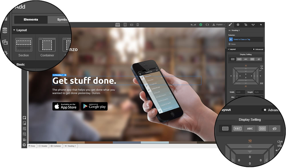
Webflow Site Designer: Einfachheit trifft Präzision

Das Herzstück von Webflow ist der Designer – eine visuelle Oberfläche, mit der du Websites bis auf den letzten Pixel gestalten kannst.

Aber im Gegensatz zu klobigen Drag-and-Drop-Baukästen respektiert Webflow, wie das Web wirklich funktioniert: jede Sektion, jedes Div, jede Stiländerung wird im Hintergrund direkt in sauberes HTML, CSS und JavaScript übersetzt ✨

Du bekommst also volle Kontrolle über alles

Webflow Designer

…aber das bedeutet auch: du solltest verstehen, wie Webseiten aufgebaut sind (oder zumindest bereit sein, es zu lernen).

Die gute Nachricht?

In 2025 gibt es drei verschiedene Wege, ein neues Webflow-Projekt zu starten – von einsteigerfreundlich bis komplett hands-on:

  1. 🧠 AI Site Builder Beta: Die neueste – und wahrscheinlich umstrittenste – Option:

    Beschreibe, welche Art von Website du willst, wähle einen Stil, und Webflows KI erstellt dir automatisch eine vollständige Homepage (oder ein ganzes Multi-Page-Layout) – mit echten Sektionen, Dummy-Content und brauchbarer Gestaltung.

    Einzigartig in 2025? . Aber für schnelle Wireframes, MVPs oder kreative Blockaden absolut nützlich.

    Das Ergebnis ist nicht perfekt – aber ein solider Ausgangspunkt, den du komplett im Designer anpassen kannst.

  2. 🎨 Start mit Vorlage: Wenn du das Grundgerüst überspringen und direkt loslegen willst, bietet Webflow eine Bibliothek mit über 100 Vorlagen (ca. 30 kostenlos, der Rest kostenpflichtig).

    Manche sind minimal und schnell, andere enthalten Animationen, CMS-Strukturen und komplette Unterseiten – von einfachen Themes für private Projekte bis zu Premium-Vorlagen ($40–80), die von Profis aus der Webflow-Community gebaut wurden.

    Natürlich sind alle Templates vollständig editierbar – du kannst also Layout, Farben, Inhalte und Responsivität komplett nach deinem Stil anpassen.

  3. 💻 Blank Canvas (a.k.a. echtes Webflow-Modus): die klassische Webflow-Erfahrung – für alle, die maximale Kontrolle wollen.

    Du beginnst mit einer leeren Seite und ziehst Layout-Bausteine wie Sections, Container, Grids, Flexboxen oder Div Blocks hinein – dazu Texte, Bilder, Buttons, Formulare, Videos oder Custom Embeds.

    Jeder Pixel, jede Animation, jeder Media Query ist deine Entscheidung. Aber auch deine Verantwortung – denn du baust die Struktur selbst:

    Du willst ein zentriertes Kästchen? Dann erstelle ein div, setze es auf „relative“, gib ihm Maße – willkommen im echten Web, mein Freund.

Wenn das abschreckend klingt: keine Sorge – Webflow bietet Hilfen und visuelle Kontroll-Elemente (inkl. CSS-Menüs und Gerätevorschau), die dich Schritt für Schritt durchleiten.

Webflow Site Designer ausprobieren ›

Das Panel Interaktionen macht es kinderleicht, Hover-Effekte, Scroll-Reveal, Page-Load-Animationen und Klick-Trigger zu erstellen – ganz ohne JavaScript (es sei denn, du willst natürlich!).

Auch das responsive Design-System von Webflow gehört zu den besten am Markt:

  • Alle wichtigen Breakpoints (Desktop, Tablet, Mobile quer & hochkant) sind eingebaut
  • Stile für jede Bildschirmgröße können visuell angepasst werden – und Änderungen vererben sich automatisch, ganz wie in echtem CSS
  • Du kannst sogar eigene Breakpoints definieren, falls die Standardansicht mal nicht reicht

Und falls du dich beim Anmelden als „kein Coder“ markierst, übernimmt Webflow sogar mobile Stile für dich automatisch.

Fazit: Egal ob du mit KI, Vorlage oder leerem Blatt startest – Webflow gibt dir alles an die Hand, um deine Website wirklich zu deiner eigenen zu machen.

Im nächsten Schritt schauen wir uns an, wie Webflow Inhalte strukturiert:

Webflows Content Management System

Eine Website besteht nicht nur aus Boxen und Buttons – sie lebt von Inhalten.

Und das CMS von Webflow hilft dir, diese Inhalte wie ein Profi zu strukturieren – selbst wenn du noch nie ein Backend gesehen hast 🫣

Im Gegensatz zu klassischen Baukästen, bei denen alles statisch ist – oder WordPress, wo du bei jedem Update hoffen musst, dass dein Plugin-Stapel nicht implodiert – setzt Webflow auf einen visuellen, aber schema-basierten Ansatz zur Inhaltsverwaltung.

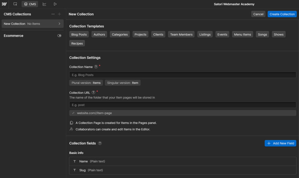
Denk an: Notion trifft Airtable… aber fürs Web.

Das zentrale Element sind die sogenannten Collections – wiederverwendbare Inhaltstypen, die du komplett selbst definieren kannst. Jede Collection enthält beliebige Eigenschaften bzw. Felder, die du nach Bedarf festlegst.

Beispiele gefällig?

  • Blogartikel mit Titel, Autor, Veröffentlichungsdatum, Vorschaubild, Tags und Hauptinhalt
  • Portfolio-Projekte mit Bildergalerien, Links, Kundenstimmen und Kategorien
  • Teammitglieder mit Funktion, Avatar, Kurzbiografie und Social Links

Webflow CMS

Sobald du eine Collection erstellt hast, kannst du:

  • Dynamische Seiten automatisch generieren, z.B. /blog/webflow-tutorial
  • Collection-Inhalte in beliebigen Listen, Grids oder Slidern anzeigen – mit Filter- und Sortierfunktion basierend auf jedem beliebigen Feld
  • Layout-Blöcke mithilfe von konditionaler Sichtbarkeit ein- oder ausblenden – je nach Inhalt

Das Beste: All das funktioniert visuell – ohne Datenbanken, ohne PHP-Funktionen, ohne Plugins für „benutzerdefinierte Beitragstypen“.

…Und für alle, die trotzdem die Kontrolle brauchen: Ja, das CMS von Webflow lässt sich via API oder Embeds auch mit externen Tools verbinden.

Der Webflow Editor

Für die laufende Bearbeitung von Inhalten (nach Veröffentlichung deiner Seite) gibt es den Webflow Editor – ein schlanker Frontend-Modus für Content-Updates.

Man kann ihn sich als „Kundenfreundlicher Modus“ vorstellen:

🖱️ Text oder Bild direkt auf der Live-Seite anklicken und bearbeiten
Füge neue Collection-Einträge hinzu – ohne in den Designer zu müssen
🔒 Das Layout bleibt geschützt, während Kunden Inhalte ändern können

Ideal für Solo-Creators, kleine Teams – oder Kunden, die bloggen möchten, ohne das Design zu berühren.

Mehrsprachigkeit? Jetzt nativ integriert

Lange Zeit war Mehrsprachigkeit ein leidiges Thema in Webflow – man musste Drittanbieter wie Weglot nutzen oder komplizierte Workarounds basteln.

Doch das hat sich mit Localization 2.0 geändert:

🌐 Definiere Sprachen und eigene Subdirectories (z. B. /de/, /fr/)
🈯 Übersetze einzelne Felder, Bilder und SEO-Metadaten je Sprache
🔁 Wechsle die Sprache visuell über Dropdowns oder dynamische Links

Wichtig: Dieses Feature ist derzeit kostenpflichtig – funktioniert aber nativ und nahtlos im Zusammenspiel mit dem CMS. Ein riesiger Fortschritt im Vergleich zu früher.

Fazit: Das Webflow CMS deckt locker 90 % von dem ab, was ein „Headless CMS“ kann – nur ohne die Kopfschmerzen.

Nächster Schritt – wie bringt man seine Meisterwerke live? 🛰️

Veröffentlichung und Hosting

Mit Webflow veröffentlichst du deine Website buchstäblich per Klick. Kein Witz – Deployment ist direkt in die Designer-Oberfläche integriert:

– einfach auf „Publish“ klicken, Staging- oder Produktionsdomain auswählen – und deine Seite ist in wenigen Sekunden live.

Webflow publishing

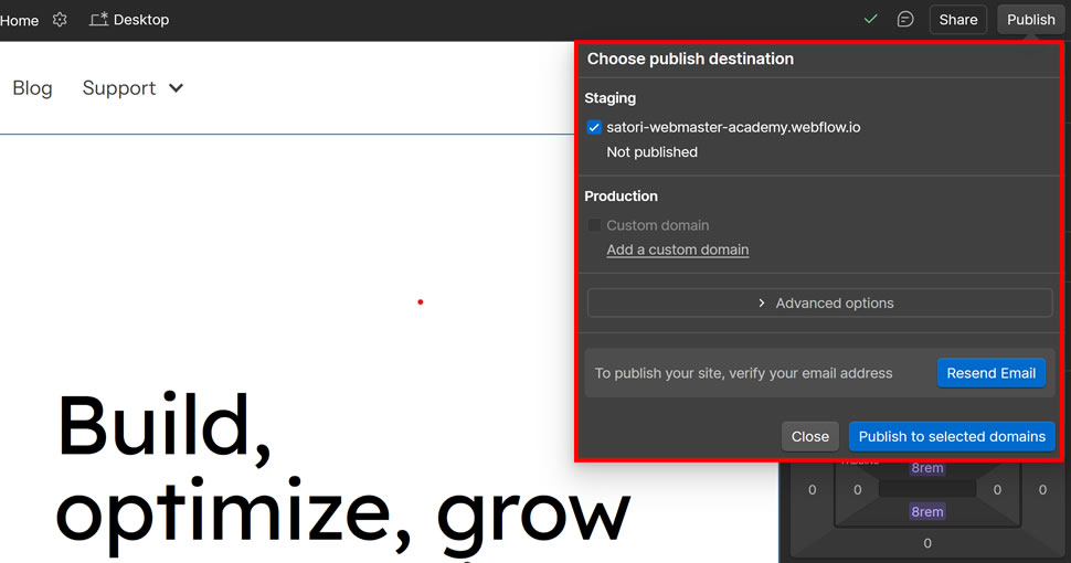
Kein cPanel. Kein FTP. Keine DNS-Albträume (okay, vielleicht einmalig, aber das DNS-Panel von Webflow gehört zu den übersichtlichsten überhaupt).

Du kannst veröffentlichen auf:

  • eine 💸 kostenlose Staging-Subdomain wie [deineseite].webflow.io
  • jede eigene Domain über DNS-Einträge
  • mehrere Umgebungen gleichzeitig – falls du ein höheres Abo hast

Nach dem Deployment läuft deine Website auf Webflows globaler Infrastruktur – hier ein Blick unter die Haube:

Was steckt technisch dahinter?

Webflow Hosting wird betrieben über Amazon Cloudfront und Fastly – zwei Schwergewichte in Sachen Performance und Verfügbarkeit:

  • Automatisch skalierbare Infrastruktur: kein Server-Upgrade nötig, auch nicht bei Traffic-Spitzen
  • SSL inklusive: jede Seite erhält automatisch ein kostenloses, dauerhaft aktives HTTPS-Zertifikat
  • Intelligentes Caching: Inhalte werden weltweit in Sekunden aktualisiert – ganz ohne manuelle Cache-Verwaltung

Das ist kein Shared Hosting und auch kein „Managed WordPress“ – es ist eher 🚀 Enterprise-Cloud ohne DevOps-Aufwand.

In dieser Hinsicht orientiert sich Webflow eher am Website-Builder-Prinzip: kein Server-Setup, keine Plugin-Updates, keine Kompatibilitäts-Patches –

es funktioniert einfach.

Fazit: Webflow Hosting liefert dir Geschwindigkeit, Skalierbarkeit und Sicherheit – ganz ohne Aufwand. Du klickst „Publish“ – und es ist live.

Als Nächstes: Wie gut funktioniert Webflow fürs Verkaufen im Netz?

Webflow eCommerce: Noch nicht ganz Shopify – aber nah dran

Eines der meistgewünschten Features in der Webflow-Geschichte? Verkaufen können.

Und ja – Webflow eCommerce ist inzwischen voll in die Plattform integriert. Du kannst damit:

🏪 Eigene Produktseiten erstellen
🛒 Warenkorb- und Checkout-Flows frei gestalten
🖼️ Jedes Detail deines Shops designen – keine starren Vorlagen
🎛️ Produkte, Bestellungen und Mails im gleichen Backend verwalten

Also… kann es Shopify ersetzen?

Noch nicht ganz – aber es kommt näher dran.

Der große Vorteil von Webflow eCommerce ist derselbe wie beim Rest der Plattform: maximale Designfreiheit.

Keine starren Store-Themes. Keine Plugin-Hölle. Du gestaltest jedes Element – von der Produktseite über den Warenkorb bis zu den E-Mails – wie jede andere Webflow-Seite.

Das ist ein Game-Changer, wenn du je mit Shopify Liquid oder WooCommerce CSS-Overrides kämpfen musstest.

Weitere Pluspunkte:

  • Unterstützt physische und digitale Produkte
  • Eigene Felder für Varianten, technische Daten, Downloads usw.
  • Anpassbare Checkout- und Dankeseiten
  • Gebrandete Bestellmails und automatische Warenkorb-Erinnerungen
  • Integrierte Bezahlung via Stripe und PayPal

Für Designer und produktzentrierte Marken, die Wert auf ein pixelgenaues Frontend legen, ist das fast ein Traum.

Allerdings sollte man nicht verschweigen: Stand 2025 ist Webflow eCommerce noch in Entwicklung – und einige Funktionen fehlen oder sind eingeschränkt im Vergleich zu Shopify oder WooCommerce:

  • Kein integrierter Multi-Währungs-Support
  • Keine POS-Integration (Point of Sale)
  • Keine nativen Abo-Produkte
  • Rabatt-Logik (z. B. auf Warenkorbebene) nur eingeschränkt möglich
  • Kundenkonten nur über das Memberships-Feature verfügbar

Einige dieser Punkte stehen auf der Webflow-Roadmap – andere könnten nie nativ umgesetzt werden. Wenn du also einen großen Shop mit komplexer Infrastruktur oder POS-Anbindung brauchst, gilt: nimm Shopify und schlaf ruhig.

Aber für kleinere Shops, One-Product-Brands, digitale Produkte oder kreative Custom-Stores mit starkem Designfokus bleibt Webflow extrem attraktiv.

Fazit: Webflow eCommerce eignet sich hervorragend für kleine bis mittlere Shops, bei denen Branding, visuelle Freiheit und Flexibilität wichtiger sind als reine Feature-Masse.

Okay – Zeit für den spannenden Teil: Was kostet das Ganze?

Webflow Preisgestaltung

Ja, Webflows Preisstruktur ist… chaotisch. Aber sie ergibt Sinn – sobald man das Grundprinzip verstanden hat.

Der wichtigste Punkt dabei:

Webflow verwendet ein zweischichtiges Preismodell mit zwei Komponenten: Workspaces für dein gesamtes Konto und Site-Pläne für jedes einzelne Projekt (also jede Website).

Um das Ganze verständlicher zu machen, haben wir diese Grafik erstellt, die alle Webflow-Pläne visuell erklärt:

Webflow Preisstruktur

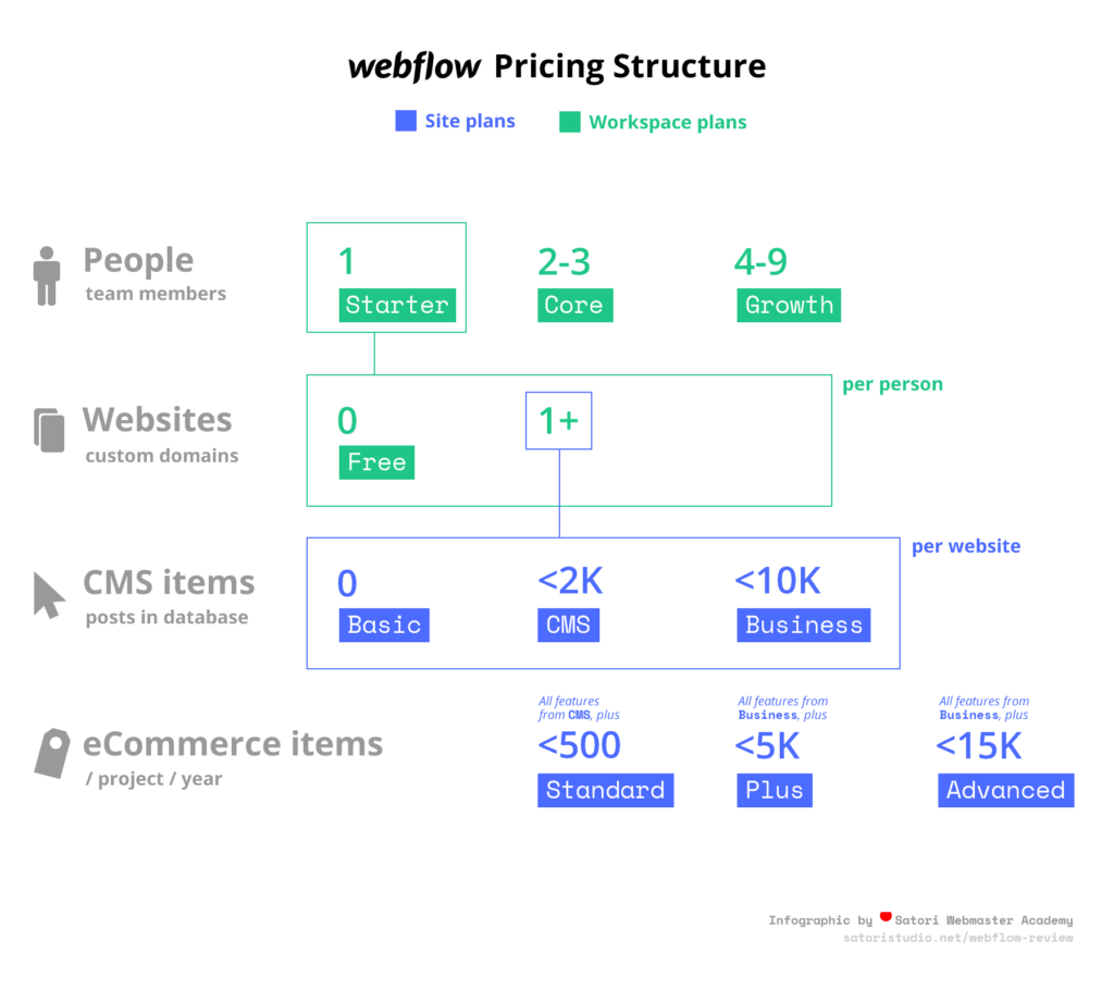
Workspaces dienen dazu, Websites in Gruppen zu organisieren, inklusive getrenntem Zugriff und Teamfeatures – ideal für Agenturen oder Freelancer mit mehreren Kunden.

Wenn du dich anmeldest, bekommst du automatisch 1 Workspace-Sitzplatz, zu dem du beliebig viele Websites hinzufügen kannst.

Site-Pläne (Hosting pro Website)

Hier entscheidet sich, wie viele Seiten, CMS-Inhalte und wie viel Traffic deine Website verkraftet:

  • Starter (kostenlos): 2 Seiten, 20 CMS-Sammlungen, 50 CMS-Items, 1 GB Bandbreite, 50 Formular-Einsendungen (lebenslang). Keine eigene Domain möglich.
  • Basic – $14/Monat: Ideal für kleine Seiten & Landingpages. 150 Seiten, unbegrenzte Formulare, 10 GB Bandbreite.
  • CMS – $23/Monat: Perfekt für Blogs und Content-Websites. 20 Sammlungen, 2.000 Items, 50 GB Bandbreite, Site-Suche, 3 Editor-Zugänge.
  • Business – $39/Monat: Für Seiten mit hohem Traffic. 300 Seiten, 40 Sammlungen, 10.000 Items, 100 GB+ Bandbreite, Uploads, 10 Editoren.
  • Enterprise: Maßgeschneiderte Lösung für große Projekte – mit unbegrenztem Volumen, SLA und dediziertem Support. Preis auf Anfrage.

Wenn du auf deiner Website Produkte verkaufen möchtest, brauchst du einen separaten eCommerce-Plan:

eCommerce-Pläne (für Online-Shops)

Diese Pläne erweitern die normalen Site-Pläne um Shop-Funktionalität:

  • Standard – $29/Monat: Bis zu 500 Produkte, 2 % Transaktionsgebühr an Webflow.
  • Plus – $74/Monat: Bis zu 1.000 Produkte, 0 % Webflow-Gebühr.
  • Advanced – $212/Monat: Bis zu 3.000 Produkte, 0 % Gebühr, unbegrenzter Umsatz, Team-Zugänge.

Alle Pläne enthalten CMS, Checkout, Warenkorb, Bestell-E-Mails, Stripe/PayPal, Steuerberechnung und Basis-Integrationen. Unterschiede gibt es bei Anzahl der Produkte & Transaktionskosten.

Und jetzt (vorsichtig!) zur zweiten Schicht:

Workspace-Pläne (Zugriff & Zusammenarbeit)

Wie erwähnt, definieren Workspaces wer an welchen Projekten mitarbeiten darf – und mit welchen Rechten:

  • Free Seat: Nur Leserechte (z. B. für Feedback oder Kundenkorrekturen).
  • Limited Seat – $15/Monat: Eingeschränkte Bearbeitung (z. B. für Redakteure/Marketing).
  • Full Seat – $39/Monat: Voller Zugriff: Designer, Einstellungen, Hosting, Abrechnung – alles.

Puh…

Was heißt das jetzt konkret?

  • Ein komplettes Team braucht mindestens 1 Full Seat + Site-Plan pro Projekt.
  • Persönliche Einzelprojekte kommen auch ohne bezahlten Sitzplatz aus – Site-Plan reicht.
  • Für Kunden reicht oft ein Free oder Limited Seat, wenn nur Inhalte gepflegt werden sollen.

Fazit: Günstig ist es nicht – aber wenn du Design, Hosting, CMS und Zusammenarbeit auf Profi-Niveau willst, liefert Webflow das Komplettpaket. Besonders mit den neuen, flexiblen Sitzplatz-Modellen ab 2025.

Vorteile und Nachteile von Webflow

Zeit für einen ehrlichen Check: Wo glänzt Webflow – und wo gibt’s noch Nachholbedarf?

  • Volle visuelle Kontrolle über Layout und Stil – keine starren Templates, kein Code nötig (außer du willst)
  • Sauberer, produktionsreifer Code – exportierbar und dev-freundlich
  • Integriertes CMS mit schema-basierten Collections – ideal für Blogs, Portfolios, Verzeichnisse und mehr
  • Top responsives Design-System – mit Breakpoints, Gerätevorschau und vererbbaren Styles
  • Sofortige Veröffentlichung auf Staging oder Custom-Domain – ganz ohne Server, FTP oder cPanel
  • Enterprise-Hosting via AWS/Fastly – mit globalem CDN, SSL und automatischer Skalierung
  • Native Mehrsprachigkeit (endlich!) – inkl. Subdirectory-Struktur und feldgenauer Übersetzung
  • Vollständig anpassbarer eCommerce – inkl. Checkout, Produktseiten, Mails und Warenkorb-Logik
  • Flexibles Preismodell – kostenlos starten, später skalieren; neue Sitzplatzstruktur senkt Teamkosten
  • Aktive Weiterentwicklung – große Updates wie Memberships 1.0, DevLink für React und AI-Builder in den letzten 12 Monaten
  • Deutlich steilere Lernkurve als bei Wix, Squarespace oder klassischen Baukästen – gerade für Einsteiger
  • eCommerce noch nicht voll ausgereift – kein Multi-Currency, keine nativen Abos, keine Kundenkonten (außer via Memberships)
  • Komplexe Preisstruktur – Site-, eCommerce- und Workspace-Pläne sind anfangs schwer zu durchblicken
  • Limits bei CMS-Items in kleineren Tarifen – große Content-Sites stoßen schnell an die 2k/10k-Grenze
  • Kein CMS-Backup oder Versionsverlauf – nur für Design-Elemente verfügbar
  • Einige Integrationen erfordern Drittanbieter (z. B. Zapier, Make, Memberstack) für komplexere Workflows oder Bezahlmodelle
  • Noch begrenztes Plugin-Ökosystem – im Gegensatz zu WordPress gibt es (noch) keine große Add-on-Bibliothek

Fazit: Webflow ist eine Plattform für Profis, die Präzision, Performance und Design-Freiheit suchen – keine Abkürzungen. Ja, sie ist anspruchsvoller und teurer – aber das Ergebnis lohnt sich.

Blitz: Häufige Fragen zu Webflow

Bevor wir zum finalen Fazit kommen – hier sind die Fragen, die uns zu Webflow am häufigsten gestellt werden:

Was ist Webflow?

Webflow ist eine hybride Plattform zur Website-Erstellung, die die visuelle Freiheit eines Design-Tools mit der Kontrolle von handgeschriebenem Code verbindet. Du kannst voll funktionsfähige Websites gestalten, verwalten und veröffentlichen – ganz ohne Programmierkenntnisse, aber mit Code-Präzision im Hintergrund.

Wie viel kostet Webflow?

Webflow hat ein zweischichtiges Preismodell: Workspace-Pläne für dein Konto und Site-Pläne für das Hosting einzelner Websites. Die Preise reichen von kostenlos bis etwa $36/Monat – je nach Umfang und Anforderungen. Alle Details findest du in unserer Preissektion oben.

Ist Webflow einfach zu bedienen?

Webflow hat definitiv eine gewisse Einstiegshürde, besonders für Anfänger. Aber sobald man das Layout- und Stilprinzip verstanden hat (ähnlich wie HTML/CSS), wird es zu einem intuitiven und sehr mächtigen Tool. Es ist einfacher als Hand-Coding, aber komplexer als klassische Baukästen wie Wix oder Squarespace.

Für wen ist Webflow am besten geeignet?

Webflow eignet sich besonders für Designer, Entwickler, Agenturen und Gründer, die maximale gestalterische Freiheit ohne Programmierung wollen. Auch Teams profitieren davon, weil Design, Inhalte und Veröffentlichung in einer Plattform zusammenkommen.

Unterstützt Webflow eCommerce?

Ja, Webflow enthält eine integrierte eCommerce-Funktion. Du kannst individuelle Produktseiten, Warenkorb und Checkout gestalten, Lagerbestand verwalten und gebrandete E-Mails verschicken. Noch nicht ganz auf Shopify-Niveau – aber was Designfreiheit angeht, sehr stark. Mehr dazu in der eCommerce-Sektion.

Webflow vs. WordPress – ein Ersatz?

Für viele Anwendungsfälle: Ja. Webflow ersetzt Plugins, Themes und Hosting-Konfiguration durch eine einheitliche, visuelle Plattform. Allerdings bietet WordPress nach wie vor eine größere Auswahl an Plugins und Community-Lösungen für Sonderfälle.

Alright… that was lot of information to take in! So what’s the bottom line? In other words –

Unser Fazit: Solltest du Webflow in 2025 verwenden?

Wir nutzen Webflow seit 2016 – über Dutzende Projekte, große Updates und kleine Entdeckungen hinweg. Und hier ist unser abschließendes Urteil:

Webflow ist eine der leistungsstärksten Plattformen zur Website-Erstellung auf dem Markt. Wenn du bereit bist, die Lernkurve zu meistern, bekommst du Profi-Tools, saubere Workflows – und nie wieder Stress mit Plugins.

☝️ Aber Vorsicht: Für jeden ist es nicht

Wenn du in 10 Minuten eine Onepager-Seite zusammenklicken willst oder auf viele externe Integrationen angewiesen bist, fährst du mit WordPress oder Squarespace wahrscheinlich besser.

Aber wenn dir wichtig ist:

  • Designfreiheit – ganz ohne Code,
  • sauberer Front-End-Code ohne Bloat,
  • ein flexibles CMS mit nativer Mehrsprachigkeit,
  • skalierbares Hosting & eCommerce in einer Plattform,

…dann ist Webflow definitiv einen Versuch wert.

Die Plattform wächst mit dir – vom Solo-Portfolio über Agenturprojekte bis hin zu umfangreichen Produktseiten mit Login-Bereich und dynamischem Katalog.

Webflow kostenlos testen ›

Danke, dass du dir die Zeit genommen hast, unsere Analyse zu Webflow zu lesen! War der Beitrag für dich hilfreich? Möchtest du etwas ergänzen oder widersprechen? Lass uns unten in den Kommentaren diskutieren!

Einige der Links in diesem Artikel sind sogenannte Affiliate-Links. Das bedeutet, wir erhalten eventuell eine kleine Provision, wenn du über einen solchen Link etwas kaufst – für dich ändert sich am Preis natürlich nichts. Wenn dir dieser Guide geholfen hat, ist das eine schöne Möglichkeit, unsere Arbeit zu unterstützen. Danke!

How to Start a WordPress Website in 2025: Beginner’s Guide to WP Setup

Here’s the thing: while WordPress is famously beginner-friendly, the first steps can still feel like assembling IKEA furniture without the instructions.

Domain names, hosting, themes, plugins, admin panels, SSL certificates, permalinks… what even is a permalink?

This guide is here to de-mystify all of it.

You’ll learn how to set up your first WP site the right way — from picking the right tools to clicking that shiny “Publish” button. No fluff, no jargon soup. Just a step-by-step walkthrough from someone who’s built dozens if not hundreds of WordPress websites since 2009.

Let’s get started 👇

What Is WordPress (Really)?

It powers a quarter of the Internet. It is by far the most popular way of creating and maintaining a website. It is free for anyone to use and modify in any way they want. But what is WordPress?

Let’s clear the fog: WordPress isn’t a website builder like Wix or Squarespace. It’s not a hosting service. And it doesn’t come with a neon “Launch Me” button either.

So… what is it?

WordPress is a free, open-source tool that helps you build and run websites. More precisely, it’s what’s called a Content Management System (CMS) — which is a fancy way of saying it handles all the behind-the-scenes stuff (text, images, menus, pages, users, settings) so you can focus on making your site look and work the way you want.

No coding required. Pinky swear.

It’s made up of three main ingredients:

  • WordPress Core – the actual CMS software that runs the show
  • Themes – these control how your website looks (layout, fonts, colors, the rest of the vibes)
  • Plugins – add-ons that make your site do more things (like contact forms, shops, SEO tools)

Think of it like this: WordPress Core is your house’s structure, themes are the interior design, and plugins are all the appliances and gadgets.

What can you do with WordPress?

  • Create and manage pages and blog posts
  • Customize your site’s appearance (without breaking anything)
  • Add functionality like email forms, image sliders, shopping carts, forums — you name it
  • Collaborate with other users (admins, authors, editors, contributors — each with their own superpowers)

But here’s what WordPress doesn’t do by default:

  • It doesn’t give you a domain name like mycoolwebsite.com — you’ll need to buy that separately (check out our domain guide)
  • It doesn’t host your website — you’ll need a place to “put” it (here’s our definitive guide on choosing a hosting provider)
  • It doesn’t magically write or design your content for you (yet 😏)

Don’t worry — we’ll walk you through all of that in this guide, with links to our best tutorials along the way. But first: is WordPress still a smart choice in 2025?

Should You Use WordPress in 2025?

Before we get into tools and settings and fancy themes, let’s ask a more fundamental question:

Is WordPress actually the right choice for your project?

Because while WordPress is powerful, flexible, and everywhere — it’s not always the best fit. But…

  • If you want full control over your site (without paying monthly fees)
  • If you’re okay learning a few new things along the way
  • If you want the ability to scale, customize, and actually own your site

…then WordPress is still one of the best options in 2025.

But let’s look at the competition for a sec.

When not to use WordPress

If you’re just testing an idea, need a single landing page up today, or absolutely don’t want to deal with hosting, domains, or plugins — then you might be better off with a site builder like Wix, Squarespace, or Webflow.

Those tools bundle everything (including hosting), and give you drag-and-drop control out of the box.

But the tradeoff?

You pay monthly, get fewer customization options, and once you’re in — you’re in. Moving away later is like trying to leave a cult with stylish fonts.

Why WordPress still wins (for most people)

Here’s why over 40% of websites still run on WordPress:

  • You can start free — the software is open-source and the vast majority of plugins and themes cost nothing
  • It’s endlessly flexible — blogs, portfolios, shops, forums, newsletters, even entire SaaS apps can be built on WP
  • You’re not alone — if you run into a problem, someone’s already solved it (and blogged about it)
  • You keep control — no proprietary lock-in, no surprise shutdowns, no weird limitations

Major sites like TechCrunch, BBC America, and even parts of whitehouse.gov use WordPress. If it works for them, it’ll probably work for you too.

So unless you have a very niche use case or hate learning new tools, WP is a solid bet in 2025.

Next, let’s open the package:

What You Need Before You Start

Before you can install WordPress and start tweaking settings like a pro, there are two essential things you’ll need to get sorted:

1. Domain Name

That’s your address on the Internet — the yourwebsite.com part.

You can register one via services like Namecheap, GoDaddy, or through your hosting provider.

But don’t rush it — your domain name matters more than you think. We’ve got an entire guide on choosing a domain if you’re not sure where to start.

2. Hosting Provider

This is where your website will “live” — a server that stores your files and delivers them to visitors.

There are thousands of hosting providers out there, but not all play nice with WordPress. Look for one that offers:

  • 1-click WordPress installs (saves a ton of time)
  • Free SSL certificate (for that secure https://)
  • Decent support (preferably with live chat)

Short on time? Go for Hostinger. Feel like going into the nitty-gritties? Check out our hosting guide.

Optional: A Local or Staging Setup

If you want to experiment before going live, you can set up WordPress on your computer (a “local” site) or use your host’s staging environment. This is especially useful for playing around without breaking anything on the public version.

Tools like Local by Flywheel make it ridiculously easy.

* * *

Once you’ve got your domain and hosting ready, it’s time to install WordPress.

You’ve got two options — and we’ll walk through both of them next.

Installing WordPress (2 Easy Methods)

Alright — you’ve got your domain, your hosting, and that glint of ambition in your eye.

Let’s get WordPress up and running.

There are two main ways to install WordPress:

  • Easy Mode: one-click install via your hosting control panel
  • Manual Mode: doing it yourself (still pretty simple, promise)

Pick whichever feels more comfortable. They both lead to the same result: a blank but functional WP site you can start customizing right away.

Method 1: One-Click Install (Recommended)

Most decent hosting providers offer a WordPress installer in their dashboard — usually under funky names like “Softaculous”, “Installatron”, or just a WordPress logo.

It’ll ask you to fill out a short form:

  • Site Name and Tagline – you can change these later
  • Admin username – please don’t use “admin” 🙏
  • Admin password – strong and unique (a password manager helps)
  • Email address – use one you actually check
  • Install path – leave blank if this is your main site (more on that below)

Click “Install”, wait 30 seconds, and boom — you’ve got a website.

What’s this “install path” thing? If you leave it blank, WordPress goes into the root folder (your main domain). If you add something like blog, your site will live at yourwebsite.com/blog. That’s useful if you want to run multiple sites later.

Method 2: Manual Install (The Nerdy but Useful Way)

If your host doesn’t offer one-click installs, or you just want to flex some technical skills, here’s how to do it manually. Total time: ~10 minutes.

  1. Download the latest version of WordPress from the official repository at wordpress.org
  2. Create a new MySQL database + user in your hosting panel (usually under “Databases”)
  3. Unzip WordPress and rename the folder to whatever you want (e.g. myawesomeproject)
  4. Upload the folder to your server via FTP using FileZilla or your host’s file manager
  5. In your browser, go to yourdomain.com and follow the setup wizard — enter your database info, pick admin username/password, etc

That’s it — you’re in! You can now log into your WordPress dashboard by visiting:

yourdomain.com/wp-admin

Bookmark that link. You’ll be using it a lot.

Next up: the settings you’ll want to tweak right away (before adding any content or themes).

Must-Change WordPress Settings

You’ve installed WordPress — congrats! 🎉 Before you start designing or publishing posts, let’s take five minutes to dial in some key settings.

Why now? Because a few defaults are… not great. And fixing them later is going to be increasingly messy.

Here’s what to do right after installing WP:

General Settings

Go to Settings → General in your WP dashboard. Fill out:

  • Site Title – this shows up in browser tabs and search results
  • Tagline – optional, but good for SEO if it describes what your site does

Also check:

  • Timezone – set it to your actual location so posts and backups get the correct timestamps
  • Date + Time Format – personal preference, but it affects how things display to visitors

Discussion Settings

Head to Settings → Discussion. If you plan to allow comments (for a blog or community site), go ahead and leave “Allow people to post comments” on. If not — turn it off and enjoy the silence.

Other smart tweaks:

✅ Enable “Comment must be manually approved” (trust me on this one)
❌ Disable pingbacks + trackbacks (they’re mostly spam these days)
✅ Enable threaded comments (looks cleaner if you do allow discussions)

Permalink Structure

This one’s crucial for both humans and search engines. Go to Settings → Permalinks and choose:

✔️ Post name

This setting turns ugly URLs like yourwebsite.com/?p=123 into clean, readable ones like yourwebsite.com/awesome-guide. Much better.

Remove Sample Content

WordPress installs often come with junk like a “Hello world” blog post or a “Sample Page”.

Delete them from Posts and Pages to avoid weird stuff showing up in your menus or sitemap.

* * *

Once that’s done, your site is cleaner, safer, and better prepared for Google (and humans).

Next up: how to make your site actually look and work the way you want — with themes and plugins:

Your First WP Themes and Plugins

Now that your site is lean and freshly installed, it’s time to give it some personality — and power.

This is where themes and plugins come in.

Plugins: What Your Site Can Do

Plugins are where the magic happens. They add new features to your WordPress site — things like contact forms, SEO tools, online stores, performance boosters, you name it.

There are 59,000+ plugins in the official repo alone, but don’t go overboard. A few well-chosen plugins will do more for your site than 30 random ones.

Here are a few essential (and free) picks to get started:

  • Rank Math – an SEO plugin to optimize titles, meta tags, and search snippets
  • Akismet – filters out spam comments automatically (a must if you allow comments)
  • WPForms Lite – lets visitors contact you through simple, customizable forms
  • LiteSpeed Cache (or WP Super Cache) – helps your site load faster
  • Wordfence Security – protects against hacks, malware, and other bad stuff

Want to track your visitors? Add Google Site Kit — it connects Analytics, Search Console, and more right into your dashboard.

A Word on Plugin Bloat

Not all plugins are good for your site. Some are slow, outdated, or conflict with others. So:

  • Stick to well-reviewed, actively updated plugins
  • Only install what you actually need
  • Delete (don’t just deactivate) anything unused

Themes: How Your Site Looks

Themes control your site’s design — layout, fonts, colors, header style, blog format, all of it.

You can think of them as your website’s outfit. And yes, you can change clothes later without losing your content.

There are thousands of themes out there, but don’t just grab the first flashy one. Some are bloated, others are buggy, and a few are downright broken.

To keep it simple:

If you’re planning to use the new full-site editing features in WordPress, look for a block-based theme like Astra or GeneratePress. They play nicely with the native editor and don’t weigh your site down.

Next step? Finding a theme that doesn’t suck.
We’ve got a full guide on that → how to choose the right WP theme.

Next Steps: What to Do After Setup

At this point, you’ve got:

✔️ A working WordPress site
✔️ Clean settings
✔️ A theme that doesn’t make you cringe
✔️ Plugins doing useful things in the background

So what now?

Here’s a short roadmap for what to do next:

  • Create your first pages: usually a homepage, an about page, and a contact page
  • Add your first blog post: even a short “hello world” intro is a good way to test things
  • make sure visitors can actually find stuff
  • Set up backups: your host might handle this, or you can install something like UpdraftPlus

Optional but smart:

  • Explore new themes if you want a more custom vibe
  • Start thinking about speed optimization, caching, and security — we’ll cover all that in upcoming guides

WordPress Setup FAQ

Do I need to know how to code to use WordPress?

Nope! You can build and manage an entire WordPress site without writing a single line of code. That said, knowing a bit of HTML/CSS or using a page builder like Elementor or the built-in block editor can give you more flexibility.

What’s the difference between WordPress.org and WordPress.com?

WordPress.org is the free, open-source version you install on your own hosting. WordPress.com is a hosted service — easier to start with, but much more limited unless you pay. If you want full control, use WordPress.org (which this guide covers).

Can I change my theme later?

Yes! You can switch themes anytime without losing your content. Just keep in mind that layouts and widgets might need a little cleanup afterward, especially if you were using a page builder or a highly customized theme.

Is WordPress secure?

WordPress is secure as long as you keep it updated, use strong passwords, and install reputable plugins. Adding a security plugin like Wordfence or Solid Security is also a good move — and always keep backups, just in case.

Can I build a store or portfolio with WordPress?

Absolutely. WordPress can handle everything from online shops (using WooCommerce) to photo portfolios, membership sites, forums, or even full-blown SaaS platforms. It’s endlessly flexible if you’ve got the right plugins.

* * *

WordPress can feel overwhelming at first — but once you’ve gone through these steps, it starts to click.

You’ve got the framework. Now it’s about content, design, and making your site actually useful to visitors.

In case you’ve got questions about WordPress installation and initial setup, don’t hesitate to hit us in the comment section below – let’s discuss!

How to Choose a WordPress Theme in 2025 (Without Losing Your Mind)

☑︎ This guide has been updated for 2025

Choosing a WordPress theme can feel like walking into a massive warehouse with 50,000 outfits and zero mannequins.

They all promise speed, beauty, SEO, unicorn dust — but which one actually fits?

In this guide, we’ll break down:

  • what a theme really is (hint: it’s more than just “colors and fonts”)
  • whether you should go free or premium
  • and the 8 key things to look for when choosing the right theme for your site.

Whether you’re launching a blog, building a portfolio, or revamping your company homepage, this guide will help you avoid bloatware, design regrets, and support nightmares — so you can focus on growing your website, not babysitting it.

Let’s start from the top:

What Is a Theme?

Let’s clear up a common confusion right away: a WordPress theme isn’t just about how your site looks.

It’s the entire visual engine behind your site — layout, typography, color palette, navigation style, button shapes, blog archive design, mobile responsiveness, you name it.

Under the hood, a theme is made up of templates, stylesheets, and sometimes JavaScript magic that tells WordPress how to display your content. Some themes are barebones, others come packed with demos, animations, and bundled plugins.

But here’s the catch:

Not all templates are created equal — and more than that, they are platform-specific. A Joomla template won’t work on WordPress. A Wix layout won’t magically import into Drupal. Themes are CMS-specific by design.

So when we say “WordPress theme,” we mean: a theme built *specifically* for WordPress. And there are thousands of them. Literally.

Which brings us to the next point…

3 Ways to Design a Website (And Why Themes Win for Most People)

Let’s say you want to launch a new website. Broadly speaking, you’ve got three options:

  1. Hiring a designer + developer 🧑‍💻 can get you a stunning, custom-built website — if you’ve got several thousand dollars to spare. Even then, there’s no guarantee you’ll get something easy to maintain or update unless you also budget for ongoing dev help.
  2. Building it yourself from scratch 🔧 is awesome if you already know HTML, CSS, JavaScript, and have the free time of a hermit monk. If you’re reading this guide, chances are you’ve got better things to do than debug code at 2am
  3. Using WordPress + a theme 🎯 strikes the perfect balance for most people: it’s fast, affordable, and looks great right out of the box

Here’s why themes are the sweet spot:

  • They cost less than dinner for two — most paid themes range from $40 to $80.
  • They’re ready to go — no need to design every page from scratch.
  • Many come with pre-built layouts, demo content, and bundled plugins (like sliders, contact forms, or page builders).
  • Top themes are well-documented and often include support from the developers.
  • You can launch your site in a weekend — and still have time for Netflix.

Not sure what theme a site is using? Try our free WordPress theme detector 🔍

…Alright, now that we’ve seen why themes are a smart shortcut, let’s talk about how to actually pick a good one.

Checklist: What to Look for in a WordPress Theme

There are literally thousands of WordPress themes out there — and most of them look good in the demo.

But looks can be deceiving 😬

Here’s a no-nonsense checklist to help you avoid bloated, broken, or just plain bad themes:

✅ Who built it?

Stick to trusted theme providers — the ones who’ve been around, have solid reviews, and actually update their products.

We recommend starting with:

These marketplaces are highly competitive — which means developers have every reason to keep their code clean, secure, and modern.

✅ Does it look modern?

Good design evolves. Avoid anything that feels stuck in 2010.

Look for:

  • Clean layout with lots of white space
  • Clear, readable fonts (no Comic Sans 😅)
  • Mobile-first responsiveness
  • Minimal animations (bonus points for loading fast)

Always test the demo site on your phone and tablet before buying.

✅ Does the style match your content?

A sleek black-and-white portfolio theme won’t do you any favors if you’re launching a food blog 🍜

Ask yourself:

  • Do I need big visuals or tight paragraphs?
  • Do I want minimalism or lots of texture?
  • Is this theme built for the kind of content I plan to publish?

Don’t bend your content to fit the theme. Find a theme that fits your content.

✅ Is it made for your niche?

Sometimes a general-purpose theme works fine. But if you’re building a website in a specific field (fitness, law, real estate, etc.), you’ll likely benefit from a niche template.

These often come with:

  • Industry-specific icons, fonts, and layouts
  • Specialized plugins (e.g. booking tools for salons, property maps for real estate)
  • Pre-made demo content tailored to your use case

A niche theme can save you hours of setup and customization.

✅ Is it fast?

A beautiful theme that takes 7 seconds to load? Hard pass.

Speed affects everything — from SEO to bounce rate to your own sanity.

Use tools like:

to test the demo page of the theme before you commit.

Pro tip: an animated “pre-loader” looks cool, but it’s not a substitute for clean, optimized code ⚠️

✅ Does it include a page builder?

Unless you love hand-coding layouts, you’ll want a theme that works well with a page builder.

Most premium themes these days are compatible with:

  • Elementor
  • WPBakery (formerly Visual Composer)
  • The native WordPress block editor (a.k.a. Gutenberg)

Some even come with custom drag-and-drop builders included — just make sure they don’t lock you into weird shortcodes if you ever change themes.

✅ Is it SEO-friendly?

Look for:

  • Clean HTML structure
  • Schema support
  • Ability to set custom meta titles/descriptions
  • Compatibility with SEO plugins like RankMath or Yoast

Use SEO Site Checkup or W3C validator to scan the demo.

✅ Does it play nice with popular plugins?

At a minimum, make sure your theme supports:

  • WooCommerce (if you’re selling stuff)
  • Contact Form 7
  • WPML (if going multilingual)
  • Any builder plugin you plan to use

Bonus points if the theme includes tested styles and layouts for those plugins out of the box.

Feeling overwhelmed? Don’t worry — you don’t need a “perfect” theme. Just one that gets you 80% of the way there without slowing your site or boxing you in.

Up next: should you go free or premium?

Free vs Premium Themes: What Are You Really Paying For?

Let’s bust a myth right away: just because something costs money doesn’t automatically make it better.

There are some absolutely solid free WordPress themes out there — and we’ve even built one ourselves:
check out Bento if you haven’t already.

So what’s the deal with premium themes then?

Here’s a quick breakdown of what you typically get with each:

  • Free themes tend to be lean, clean, and… basic. Great if you want a minimal blog or starter site without fancy bells and whistles.
  • Premium themes often include full demo sites, multiple layout options, extra widgets, bundled plugins, and dedicated support.

That support part is worth emphasizing: when your layout breaks at midnight and Google doesn’t help, having a real human respond within 24 hours can save your project (and your sanity).

So which one’s right for you?

  • Go free if you’re comfortable with WordPress, don’t need fancy features, and have time to experiment.
  • Go premium if you want to save time, need a polished design out of the box, or just don’t feel like messing around with code and support forums.

🧠 Think of it like this: free themes are IKEA — affordable and functional, but you’ll do a lot of the lifting.
Premium themes are more like a well-designed prefab house — you pay a bit more, but it’s mostly move-in ready.

In the end, both can get the job done. It just depends how much time, energy, and design polish you want to invest.

Next up: where to actually find a quality theme that doesn’t suck.

Where to Find Great Themes (Without Wasting Hours)

So now that you know what to look for, the question becomes:

👉 Where do you actually find trustworthy WordPress themes?

Here are the 3 best places to start — all of them vetted, popular, and regularly updated:

  • ThemeForest
    – the largest WordPress theme marketplace in the world. Thousands of options, strong filters, detailed reviews. Just be picky — not all themes are created equal.
  • Elegant Themes
    – best known for their popular Divi theme and builder. A solid choice if you want a “design system” with lots of polish and flexibility.
  • TemplateMonster
    – a long-time provider with a wide variety of niche templates. Especially useful if you’re looking for something industry-specific.

You can also browse the official WordPress theme directory — it’s full of free options that meet core standards, although support and features can vary wildly.

💡 Pro tip: If you find a site you love and want to know what theme they’re using, try this:
free WordPress theme detector 🔍

It’ll sniff out the theme and sometimes even tell you which plugins are active.

Alright, you’ve got the tools and the roadmap.
Only one question remains: ready to pick your theme?

Still Stuck? Let’s Help You Decide

If you’ve made it this far and still feel torn between 2 (or 12) WordPress themes — don’t worry, it’s totally normal.

✨ The good news? You don’t have to figure it out alone.

Drop your situation in the comments:

  • What kind of site are you building?
  • What features or vibe are you going for?
  • Any themes you’re already considering?

We’ll reply with tailored suggestions — no upsells, no fluff, just real advice from people who’ve tried way too many themes so you don’t have to.

Or if you’d rather keep things private, shoot us a message directly via our contact page. Either way, we’ve got you.

Bottom line: the “right” theme is the one that gets you online faster, looks great to your audience, and doesn’t turn into a technical headache six months in.

You’re already ahead of most by reading this far — now let’s get that website up and running 🚀

Avada vs Enfold: Choosing the Right WordPress Theme for Your Project

With all the available options, choosing the right WordPress template can be a daunting task. For example, most top themes available on ThemeForest are so powerful and well-built that they almost look identical from the first glance. And if you’re considering Avada and Enfold as your final candidates, the choice only gets harder as both themes are TF top-sellers with massive feature sets and fantastic design. So how do we choose just one? Let’s break down the primary aspects of theme quality and find out which template is right for whom:

Close-up Comparison

There are several things to consider when buying a WordPress theme, and design plus features are by far not the only components of the mix: one should also be mindful of such aspects as search engine optimization, theme speed, item rating and reviews, and support quality. For your convenience, we’ve summarized the important factors in a table; below we will discuss them in more detail.

Avada Enfold
Year created 2012 2013
Content Builder Fusion (custom) Avia (custom)
Builder elements 55 47
One-click demos 27 27
ThemeForest sales 300,000+ 100,000+
Average rating 4.77 4.84
Price $60 $60

Both Avada and Enfold have a long history on ThemeForest, having been around for more than 5 years. Avada was the theme that probably had the most influence on the ongoing all-round, multipurpose WP theme revolution, and Enfold followed suit shortly after. The idea was to create a truly versatile and flexible theme which would allow users to build their own layouts; this implied integrating a content builder of some sort, and most themes went for the Visual Content Builder by WPBakery at first. The idea was a huge success, and nowadays you won’t find a self-respecting premium WP theme that does not use a content composer.

Avada, and later Enfold, when their own way, creating custom content builders which are fully integrated into the theme core – this meant smoother updates and zero compatibility troubles. These custom composers contain dozens of pre-made functional elements such as widgets, sliders, buttons, etc, enabling each user to build beautiful custom pages from scratch, with being confined to pre-set layouts. At the moment Avada offers 55 composer blocks, and Enfold is slightly behind with 47, yet both are continuously adding new ones to their arsenals, and the tally might change in the future.

Time flows fast in the world of web design, so over the years both themes had to keep modernizing to keep pace with the latest visual trends. Most experts would agree that Enfold has managed this path slightly better than its competitor, being more minimalist from the start. While the initial theme demos have stayed mostly intact since their creation, theme authors responded to the new design challenges, most notably the flat design movement, by creating numerous new demos based on specific user needs; whether it’s a coincidence or not, both Avada and Enfold currently offer 27 demos, and each can be easily installed with a single click as a ready-made website to tinker with and work from.

When it comes to popularity, Avada is clearly the winner, with over 300 thousand purchases on ThemeForest, Enfold having three times less. However, this can be a double-edged sword, since a huge user base can generate a wide variety of websites, so new users building a website on even a theme as versatile as Avada can have difficulties staying unique. This is mitigated by the wide variety of settings, options, layouts, and content blocks each theme offers, but should not be forgotten when choosing the right one for your website.

Support is top-notch for both themes, with entire teams of dedicated experts always ready to answer user questions. Both Enfold and Avada have extensive manuals and video tutorials, with slightly differing approaches to pre-purchase information. Avada chose to make its knowledgebase public, letting anyone to browser through its features before buying, while Enfold’s manual is contained within the downloadable theme package. However, Avada does not let non-buyers ask questions on its support forums (in fact, their forums can only be viewed by those who have the purchase code), while Enfold has a separate section on its open forums for pre-purchase questions.

Enfold has a slightly higher average rating among the two themes, standing at 4.84 as opposed to Avada’s 4.77. This might seem like an insignificant difference, but given tens of thousands reviews, even decimals can translate into large numbers of extra negative or positive opinions.

It’s easy to see that none of the themes has a clear upper hand and can be called the ultimate winner. However, there are cases in which one might be preferable over the other, and we’ll go over them in the next sections of our article.

Who Should Use Avada?

Avada is perfect for those who have little or no experience with WordPress, or need to set up a website as quickly as possible. Their extensive online tutorials and walkthroughs include countless useful articles, from general WP-related questions to specific Avada-related aspects: you might not even need to use the support ticket system at all! It is also worth keeping in mind that, as the top-selling ThemeForest item, Avada has the highest motivation to stay on top of its game by constantly improving, which is clearly evident from the frequency with which the authors publish new updates.

Who Should Use Enfold?

Enfold is a great theme for picky users who aim for absolute quality and support excellence. With this theme, websites stand slightly more chances of looking unique. Despite its 100,000+ sales, Enfold can still be called an underdog when compared to the behemoth Avada, and this gives Enfold’s authors additional motivation to keep striving for the top position.

Have you got hands-on experience with any of the themes? Still looking for the right one? Let us know what you think in the comments below!

7 Amazing Examples of Salient WordPress Theme Based Websites in 2025

Salient is one of the top-10 ThemeForest best-selling themes of all time, created by an elite author ThemeNectar. First available in April 2013, the theme was a breakthrough in terms of design, giving rise to a plethora of later imitators. Salient has since accumulated 60,000+ happy users and evolved into a full-fledged website building environment, preserving and updating its distinct visual style.

We remember our team’s initial reaction on seeing Salient for the first time: “whoa! Now these guys sure know how to design!”. Cracking it open, we saw clean, rather efficient code, adding to our respect towards the theme’s creators. Salient is distinctly minimalist, but not excessively so; this allows using it to create crisp and clean websites which still retain their individual touch.

Take Salient for a spin ›

The Salient theme is choke-full of features and settings, the most prominent additions of the last years being the internal templating system, which complements the existing drag-and-drop content builder (already a standard in premium WP themes) by allowing to use entire pre-designed page blocks or even entire layouts easily and quickly.

The ThemeNectar team is doing a great job in terms of providing timely and friendly support for the item. During our review we’ve created several “test tickets”, ranging from newbie questions to customization to developer-level inquiries; each was answered within 2 working days (most of them much faster), and none of the underlying issues was left unsolved.

Let’s See What This Baby Can Do

We won’t overwhelm you with dozens of Salient-based websites – instead, let’s look at 7 noteworthy real-life examples of the theme in action, hand-picked by our design and development team:

1. Senz

The creators of the original storm umbrella with the easily recognizable tilt, Senz use Salient for their official website. It makes extensive use of the theme’s WooCommerce compatibility to render and manage a complex online shop.

The front page slider is worth a separate mention: it features both beautiful static-image backgrounds as well as animated backgrounds and built-in animations for text elements to make it more dynamic. The front page itself is organized into several blocks using the theme’s visual content builder, ranging from product grids to full-width call-to-action sections, making it anything but boring.

2. Design Garden

This gorgeously-designed website is a learning platform created by Sabina Radeva, an Oxford, UK, based designer and illustrator. Sabina uses the Easy Digital Downloads plugin ecosystem to offer online courses to her Design Garden visitors, which blends in well with Salient.

The entire website is sprinkled with Sabina’s lovely illustrations; the theme does not stand in the way, letting the author express her talents while providing that minimalist touch to everything from navigation to the blog feed.

3. Manifesto

Let’s head to Canada and check out Manifesto Festival’s homepage for a change. This annual hip-hop culture event has been brightening Toronto’s youth scene for over a decade, and its unique essence has been successfully captured by the website’s style. Using basic colors (red, black, white), contrasting elements, bold typography and large elements, the page conveys the feeling of authenticity and freedom of expression.

The front page makes use of full-width image grids as well as clever call to action button placement to simultaneously maximize its “wow!” effect and visitor conversions. The previous years’ Manifesto editions are also worth checking out from the top menu, all those pages are also built with Salient’s visual composer.

4. Lion’s Share Digital

The Austin, TX based web design and development agency’s ambitions are reflected in their telling name. The Lion’s Share website is there to express their drive for growth and service excellency. Salient readily offers the necessary elements: large, basic fonts; colourful, full-width sections, plenty of room for imagery.

This is a great example of Salient’s full-screen header in action: on entering the website, we are immersed into an epic video presenting the brand. The rest of the page is comprised of visual composer elements tailored to give it a dynamic and colourful vibe.

5. StorNext

If you’re starting to get an impression that Salient is only good for design-focused web pages, think again. Here’s StorNext, a specialized provider of highly distributed file storage system solutions. A good example of a no-nonsense website by IT specialists, for IT specialists:

Content is king here, and Salient successfully helps the right things stand out. The website integrates a plethora of plugins, including a client-facing live chat, which works flawlessly with the theme. Another interesting thing to mention here: the StorNext website has been specifically tailored to closely resemble its parent company’s page, quantum.com – showing how easily Salient morphs and flexes to fit any design requirements.

6. Mota

Another high-tech company on our list, Mota is a hardware maker: they produce a range of cool gadgets, focusing on drones and wearables. In this case, Salient needed to support a website with a large and complicated structure, which it handles pretty well with the built-in MegaMenus.

The theme’s visual style fits perfectly with the company’s image: a future-facing manufacturer of highly advanced electronic devices. The individual product pages deserve a special mention: there’s an example of Salient’s custom visual content builder in its full glory; parallaxed images, subtle animations, specs and FAQ sections – all come together to create professional-looking and functional product presentations.

7. Gravual

Last but not least, one of our personal favourites, Gravual, is a tiny design boutique based in Antwerp, Belgium. The entire thing breathes minimalism and style, and scales extra-neatly on smartphone screens thanks to Salient’s smart grids.

This one’s a good example of Salient’s single-page capabilities: the entire website is essentially presented on the front page, with separate sections branching off where and when needed. The site’s also available in Dutch, showcasing the theme’s multilingual functions.

Your Examples?

Building a website on Salient or know any other noteworthy examples? Drop a line in the comment section below, we’ll consider including it in the list!

TemplateToaster Review – Better Than a Theme?

Any website owner faces the need to create a visual front-end for their page at some point – without its own distinct style and well-thought-through layout, a website would be virtually unusable and look unprofessional. There is a wide range of options when it comes to this process, here are some of the most popular ones:

  • Buying a ready-made theme (if you’re using a content management system like WordPress, Joomla or Magento)
  • Writing a theme yourself (requires being able to code in php, css, html and other languages)
  • Create a theme using a visual theme builder

While the first option provides ample customization opportunities if you choose the right theme that is flexible enough, you are still at the theme author’s mercy with respect to providing all necessary elements and layouts to suit your specific needs; moreover, you will need to learn how to use the theme in any case, and it will only be available for a specific content engine, so migrating later would not be possible.

Developing your own theme gives you all the control you can think of, yet requires considerably more time and effort, as well as specialized knowledge in web programming (not even mentioning the fact that in terms of code you will most probably be re-creating what others have already done thousands of times before you).

This is where the third option comes in, in the form of TemplateToaster: using this tool you can create your very own website template in a powerful yet easy to use drag-and-drop style editor, generate a template package and install it on your website. The end product is automatically mobile-friendly (responsive) and compatible with all existing web browsers. TemplateToaster is a downloadable Windows application which allows you to work offline on your local machine.

The TemplateToaster Advantage

The suite offers a plethora of editor tools for building various types of pages and any imaginable layout and visual style. Apart from text and images, there’s an extensive widget library to choose from: sliders, social media, videos, etc. In your designs, you can start from a blank canvas or modify any of the pre-built layouts included in the sample library. All standard website features such as navigation menus are also available inside the builder.

One of the most interesting and unusual capabilities of TemplateToaster is its wide CMS compatibility: using TT, you can save your designs to be installable on any of the following content management systems: WordPress, Joomla, Drupal, Blogger, Magento, and PrestaShop. You can also save your files as plain HTML/CSS, removing the CMS dependency altogether.

Trial and Pricing

TemplateToaster is available to download for free on their official website; the installer is quite large (144 Mb), yet with a decent cable/optical connection it shouldn’t take too long to finish. The trial version allows creating any number of themes and has no time limitations (which is refreshing, given today’s standards of two-four week test periods on most applications).

In order to be able to generate the installable template packages, you will need to upgrade to a paid version, which comes in two flavours: the Standard edition ($49) and the Professional edition, worth ($149). While the prices are above the average level you’d pay for a popular online site builder like Weebly, it is worth noting that the above figures are one-time payments, i.e. you won’t have to incur monthly payments unlike with the former. In this respect, even the Professional edition of TemplateToaster will pay for itself in about a year, still leaving you with the software you originally purchased, yours to use for unlimited time.

The most notable differences between the two editions, i.e. the extra features you get in the Professional edition, are as follows:

  • Possibility to start from scratch instead of editing an existing template
  • Custom positioning for modules and widgets
  • Custom page templates
  • Possibility to use custom images in templates
  • Your own logo with a hyperlink

Since most of the above are quite useful capabilities or are usually considered to be standard parts of any self-respecting website, it’s difficult to imagine many use cases for the Standard TemplateToaster edition – unless you want to test your website first and then upgrade to Professional and finish the work.

Is It Worth Using?

TemplateToaster is a neat hybrid of a CMS template and a website builder – it allows creating unlimited themes to work with most popular content management systems, at the same time offering the power and flexibility of a drag-and-drop interface which completely removes the necessity of editing any code. Cross-platform compatibility gives it an advantage over traditional CMS themes, while fixed pricing makes it a more sensible choice than a site builder with recurring billing.

The reviewed software is suitable for individual website owners of any experience level and especially for freelance web designers who make CMS templates for their clients regularly – for the former, the suite will allow building the website you need, quickly, for the latter – greatly simplify and streamline your client work.

Using TemplateToaster and would like to provide a review? Still have unanswered questions about the product? Let us know in the comments below:

The Ultimate Review 2025 – a Next-Gen Web Platform or Yet Another Site Builder?

☑︎ This review was last updated in July 2025

Let’s be honest:

most website creation options either feel like 🪀 plastic toys (site builders), a tangled mess of 🛠️ plugins and duct tape (WordPress!) – or 😵‍💫 code-heavy affairs that seem to reinvent the wheel every time.

That’s exactly the problem Webflow claims to solve:

It pitches itself as the holy grail: powerful enough for developers, visual enough for designers, and simple enough to (eventually) figure out even if you aren’t either of those.

So… is it?

We’ve been using Webflow since 2016, through dozens of own and client sites, experiments, and “eureka’s” – and this guide is the outcome.

We’ll cover the 😇 good, the 🤬 bad, and the 👹 confusing-as-hell (looking at you, pricing plans).

But first — here’s the short version:

Verdict summary: Webflow stands out as a rare blend of creative freedom and technical precision. While it comes with a learning curve and a pricing model that needs a whiteboard to decode, it rewards those who commit with unmatched design power, clean code, and streamlined hosting.

Design Freedom: pixel-perfect + responsive? Explore Designer
9/10
CMS: flexibility and ease of use? Read more
8/10
Hosting: speed and reliability? See breakdown
9/10
eCommerce: ready for serious shops? Find out
6/10
Ease of use: learning curve vs power? Our take
7/10

If you’ve ever felt torn between drag-and-drop simplicity and raw coding power — Webflow may just be the bridge you’ve been looking for.

Let’s see if it holds up.

So, What Exactly Is Webflow?

In plain English?

Webflow is an all-in-one web development platform that lets you design, build, and launch websites without touching code – unless you want to!

Think of it as the 👼 lovechild of Figma, WordPress, and VS Code:

You drag. You drop. You adjust. And behind the scenes? Webflow automatically writes production-grade HTML, CSS, and JS in real time.

However! Unlike most no-code tools that hide the technical stuff under layers of glitter, Webflow embraces the logic of front-end code – making it visual and accessible.

If you understand how margins, flexboxes, and breakpoints work (or are willing to learn), this thing is a rocket ship.

Webflow also bundles in:

Whether you’re a designer sick of depending on developers, or a dev who wants to prototype faster – Webflow is one of the few tools where both sides can meet in the middle.

⚡ What’s New in 2025?

Webflow hasn’t been sitting still since its creation back in 2013 – here are the biggest recent updates and features:

  • Localization 2.0: native multilingual support (finally!) with automatic subdirectory setup and string-based translation interface
  • Components update: reusable components now support conditional logic and dynamic slots for complex layouts
  • DevLink beta: tighter Webflow-to-React integration for teams using Webflow as a visual front-end for custom apps
  • Memberships 1.0 create gated content, login/signup flows, and even paid plans — directly in Webflow
  • Improved Figma plugin: export frames straight into Webflow with better layout preservation and style mapping

You can find more about how these affect real-world projects in the relevant sections below — or skip straight to our final verdict.

In the following sections we will deal specifically with Webflow’s core components:

Webflow Site Designer: Simplicity vs Precision

Webflow’s core superpower is the Designer — a visual interface that lets you build websites with pixel-perfect control.

But unlike clunky drag-and-drop tools, this one actually respects how the web works: every section, div, and style tweak maps directly to HTML, CSS, and JavaScript in the background ✨

That means you get to control everything

Webflow Designer

…but it also means you’ll need to understand how the web is structured (or at least be ready to learn).

The good news?

In 2025, Webflow offers 3 distinct ways to start your next website, on a scale from less to full hardcore mode:

  1. 🧠 AI Site Builder Beta This is the newest — and possibly most controversial — option:

    Describe the kind of website you want, pick a visual style, and Webflow’s AI will generate a complete homepage (or multi-page layout) with real sections, dummy content, and best-practice styling.

    Unique in 2025? No. But still great for quick wireframes, MVPs, or getting past “blank canvas syndrome”.

    The designs aren’t flawless, but they give you a clean base to iterate on — and everything stays 100% editable within the Designer.

  2. 🎨 Start from a Template: if you want to skip setup and dive straight into customization, Webflow offers a library of 100+ templates (about 30 are free and the rest are paid).

    Some are minimal and fast-loading; others come packed with animations, CMS collections, and prebuilt pages – everything from simple themes for personal projects and practice – to premium templates ($40–80) created by third-party Webflow experts

    Each template is fully editable, of course = so you can tweak layout, colors, content structure, and responsiveness however you like.

  3. 💻 Blank Canvas (a.k.a. Real Webflow Mode): the classic Webflow experience – for those who want full creative and structural control.

    You start with a single empty page and drag in layout elements like Sections, Containers, Grids, Flexboxes, Div Blocks – as well as text elements, images, buttons, forms, videos, and custom embeds.

    Every pixel, margin, animation, and media query is under your control. But so is every responsibility — because you’re building the structure yourself:

    Want a centered box? Add a div, set it to “relative”, give it dimensions – welcome to the real web, baby.

If that sounds scary, don’t worry — Webflow has toggles and guardrails (like visual CSS controls and device views) that guide you as you go.

Explore Webflow Site Designer ›

The Interactions view lets you easily set up things like hover effects, scroll-based reveals, page load animations, and click/trigger-based transitions – no JavaScript required (you know, unless you want to!)

It is also worth mentioning that Webflow’s responsive design system is one of the best around:

  • Each layout breakpoint (desktop, tablet, mobile landscape, mobile portrait) is built-in
  • You can visually adjust styles for each screen size, and changes cascade down — just like CSS
  • You can even set custom breakpoints in addition or instead of the standard ones if needed

…and if you mark yourself as a non-coder during sign-up, it will even automate mobile styles for you!

Bottom line: whether you’re starting with AI prompts, a template, or the blank page – Webflow gives you the tools to make it truly your own.

Now let’s look at how Webflow handles structure:

Webflow’s Content Managemen System

A website isn’t just boxes and buttons – it’s all about content.

And Webflow’s CMS lets you structure that content like a pro – even if you’ve never touched a backend before 🫣

Unlike traditional site builders that treat everything as static blocks – or WordPress, where you pray your plugin stack doesn’t explode – Webflow gives you a visual but schema-based approach to managing content.

Think: Notion meets Airtable… but for websites.

At the heart of it all are Collections – reusable content types that you can freely define based on your needs. For each Collection, you can define any number of properties, of fields.

For example:

  • Blog posts with title, author, publish date, featured image, tags, body
  • Portfolio projects with galleries, links, testimonials, and categories
  • Team members with roles, avatars, bios, and social links

Webflow CMS

Once you’ve created a Collection, you can:

  • Auto-generate dynamic pages, for example /blog/how-to-make-webflow-dance
  • Display Collection items in any number of lists, grids, or sliders, as well as filter and sort content by any field
  • Use conditional visibility to show/hide layout blocks based on specific field data

Te best part – all of this is done visually: no databases, no PHP functions, and no “custom post type” plugins.

…And for devs who still want data control – yes, Webflow’s CMS can connect to external tools via APIs and custom embeds.

The Webflow Editor

For live content editing (after your site is published), Webflow also offers the Editor – a front-end tool for content updates.

Think of it as a “client-friendly” mode:

🖱️ Click any text or image on the live site to edit it
Add new Collection items without entering the Designer
🔒 Keep layout locked while letting non-techies update the content

Quite handy for solo creators, teams – or clients who want blog control without touching design.

Multilingual? Now Natively Supported

For years, multilingual sites were a pain in Webflow – requiring third-party tools like Weglot or hacky CMS workarounds.

But all that is in the past, with Localization 2.0:

🌐 Define languages and assign subdirectories (like /fr/ or /de/)
🈯 Translate individual fields, images, and SEO tags per locale
🔁 Switch language visually via dropdowns or dynamic links

Note that it’s a paid add-on right now – but it works out of the box and integrates deeply with the CMS, which makes it a huge step up.

Bottom line: Webflow’s CMS gives you 90% of what a headless CMS can do – without the head trauma.

Next step – publishing your masterpiece:

Deployment and Hosting

With Webflow, you just… click a button. Seriously – deployment is built right into the Designer UI:

– hit “Publish”, choose your staging (test) and/or production domain, and your site goes live in seconds.

Webflow publishing

No cPanel. No FTP. No DNS nightmares (okay, maybe just once, but Webflow’s DNS panel is one of the cleanest out there).

You can publish to:

  • a 💸 free staging subdomain in the form of [yoursite].webflow.io
  • any custom domain via some DNS setup
  • multiple environments at once if you’re on higher-tier plans

Once deployed, your site runs on Webflow’s global infrastructure – let’s take a peek inside:

What’s Under the Hood?

Webflow Hosting is powered by Amazon Cloudfront and Fastly which deliver world-class performance, pretty much on autopilot:

  • Auto-scaling backend: no need to upgrade your server or do any manual actions during traffic spikes
  • Built-in SSL: every site gets a free and perpetual HTTPS certificate, activated automatically
  • Smart cache: your content updates go live across all regions in seconds, no cache management required

This isn’t shared or even managed WordPress hosting. It’s more like 🚀 managed enterprise-grade cloud – without the devops.

In this regard Webflow is closer to a site builder philosophy – no server management, no plugin updates, no compatibility patching, etc –

it just… works.

Bottom line: Webflow hosting gives you speed, scalability, and security without lifting a finger. Just click “Publish” — and it’s live.

Next up: how easy is it to sell on Webflow?

Webflow eCommerce: Still a Work in Progress

One of the most requested features in Webflow’s history? Selling stuff.

And yes – Webflow eCommerce is now fully integrated into the platform. That means you can:

🏪 Create custom product pages
🛒 Build your own cart and checkout flows
🖼️ Design every inch of your online store – no rigid layouts
🎛️ Manage inventory, orders, taxes, and emails from the same dashboard

So… is it ready to take on Shopify?

Not quite — but it’s getting closer.

The main strength of Webflow eCommerce is the same as the rest of the platform: complete design freedom.

No rigid storefront themes. No plugin spaghetti. You design every single page — product, cart, checkout, even emails – like any other Webflow page.

This is a game-changer if you’ve ever fought with Shopify Liquid templates or WooCommerce CSS overrides.

Other nice touches:

  • Supports physical + digital products
  • Custom fields for variants, specs, downloadable files, etc.
  • Customizable checkout and thank-you pages
  • Branded email receipts and abandoned cart flows
  • Native Stripe + PayPal payment integration

For designers and product-focused brands who want pixel-perfect storefronts, this is a dream come true.

However, it’s still worth noting that as of 2025, Webflow eCommerce is still evolving – and some advanced features are missing or limited compared to Shopify or even WooCommerce:

  • No built-in multi-currency support
  • No POS (Point of Sale) integration
  • No native subscription products
  • Limited discount logic (incl. cart-level rules)
  • Customer accounts are only available through Memberships

Some of these features are on Webflow’s roadmap – but others may never arrive natively. So if you’re running a large store, or need serious ERP/POS logistics, use Shopify and sleep well.

But for smaller shops, one-product brands, digital sales, and custom storefronts with a strong visual identity – Webflow is still a very tempting option.

Bottom line: Webflow eCommerce is ideal for small-to-medium custom storefronts – especially when branding, design, and flexibility matter more than pure feature count.

Alright, now for the meaty part: let’s look at the pricing!

Webflow Pricing

Yes, Webflow’s plans are a mess. But it starts making a lot of sense once you get used to the underlying principles.

Here’s the important thing to understand:

Webflow uses a layered pricing system with two different components: workspaces for your overall account and sites for each individual project (i.e. websites you build).

To help make sense of all this, we’ve created this “master diagram” explaining all of Webflow’s pricing plans in a more visual way:

Webflow pricing

Workspaces are used to organize groups of sites with separate access and collaboration features – think agency-level project management.

When you sign up you get 1 workspace seat by default, to which you can add one or more sites.

Site Plans (Hosting per Website)

The main difference is in how many static pages, CMS items, and max traffic you get:

  • Starter (Free): 2 pages, 20 CMS collections, 50 CMS items, 1 GB bandwidth, 50 form submissions (lifetime). No custom domain.
  • Basic – $14/mo: Ideal for small sites and landings; 150 static pages, unlimited forms, 10 GB bandwidth.
  • CMS – $23/mo: Best for blogs and content‑rich sites; adds 20 collections, 2,000 items, 50 GB bandwidth, site search, and 3 editor seats.
  • Business – $39/mo: For high‑traffic sites; 300 pages, 40 collections, up to 10,000 items, 100 GB+ bandwidth, file uploads, 10 editors.
  • Enterprise: Custom solution for large-scale needs — includes unlimited capacity, dedicated support & SLA. Contact sales to get a quote.

If you want to sell things on your website, you’ll need to use one of the three site plans for online shops:

eCommerce Plans (Add Store Functionality)

These are designed specifically for selling online – but still built on top of the above Site plans:

  • Standard – $29/mo: Up to 500 products, 2% transaction fee.
  • Plus – $74/mo: 1,000 products, zero Webflow fee.
  • Advanced – $212/mo: 3,000 products, 0% fee, team accounts, no limits on sales volume.

All include CMS, custom checkout/cart, emails, Stripe/PayPal, taxes, and basic integrations – key differences lie in how many products you can list and how much you pay in transaction fees.

Now let’s (carefully!) add the workspace layer:

Workspace Seat Plans (Team & Agency Access)

As we mentioned earlier, workspace seats determine who can collaborate on specific projects and with what level of access:

  • Free seat: View-only/reviewer access (e.g. content proofing or client corrections).
  • Limited seat – $15/mo: For content editors/marketers with restricted permissions.
  • Full seat – $39/mo: Full access — Designer, site settings, billing, the whole shebang.

Whew…

Alright, what if I need both Site + Seat? 🤔 Here are some basic principles:

  • A full team building high-end sites needs at least 1 Full seat + paid Site plan per project.
  • Simple personal sites can run solo on a site plan without buying seats.
  • Need to give editing permissions to a client? A Limited or Free seat may suffice for straight CMS updates.

Bottom line: It’s not cheap – but if you want pro-level design, hosting, CMS, and team collaboration in one bundled platform, Webflow’s pricing reflects that value – especially with the new seat flexibility as of 2025.

Pros and Cons of Webflow

Time for a sanity check. Here’s a no-BS overview of where Webflow shines — and where it still needs work:

  • Full visual control over layout and styling — no rigid templates, no code required (unless you want to)
  • Clean production-grade code output — exportable and dev-friendly
  • Built-in CMS with schema-based collections — perfect for blogs, portfolios, directories, and more
  • Best-in-class responsive tools — device breakpoints, mobile preview, cascading styles
  • Instant publishing to staging or custom domain — with no servers, FTP, or cPanel needed
  • Enterprise-grade hosting on AWS/Fastly with global CDN, built-in SSL, and auto-scaling
  • Native localization (finally!) — supports multilingual content and subdirectory-based language versions
  • Fully customizable eCommerce checkout, product pages, emails, and cart logic
  • Flexible pricing — build for free, scale later; new seat model makes team workflows more affordable
  • Active roadmap — major updates like Memberships 1.0, DevLink for React, and AI builder released in past 12 months
  • Steeper learning curve than Wix, Squarespace, or classic site builders — especially for total beginners
  • eCommerce still lacks depth — limited multi-currency, no native subscriptions, no customer accounts (outside Memberships)
  • Pricing complexity — separate plans for site, eCommerce, and workspace seats can be hard to decode at first
  • CMS item limits on lower-tier plans — easy to hit 2k or 10k item caps for large content-driven projects
  • No built-in backup/version history on CMS content (only for design elements)
  • Some integrations require 3rd-party tools (Zapier, Make, Memberstack) for advanced workflows or payments
  • Still limited plugin ecosystem — unlike WordPress, there’s no giant library of user-created add-ons (yet)

Overall, Webflow is a pro-grade platform for people who want precision, performance, and polish – not shortcuts or crutches. The price is higher, the learning curve is real, but the payoff is big.

Blitz: Frequently Asked Questions

Before we conclude with the verdict, here’s a compilation of the most popular questions we receive about Webflow:

What is Webflow?

Webflow is a hybrid website-building platform that merges the visual flexibility of a design tool with the control of custom code. It lets you create, manage, and publish fully functional websites – no coding needed, but with full code-level precision under the hood.

How much does Webflow cost?

Webflow uses a dual pricing system: account plans and site plans. Account plans manage how many projects or collaborators you can have, while site plans control each site’s hosting level. Prices range from free to $36/month depending on your needs—see our full breakdown in the pricing section above.

Is Webflow easy to use?

Webflow certainly has a learning curve, especially for first-time users. But once you get the hang of its layout and logic (which mirrors HTML and CSS structure), it becomes an intuitive and powerful visual development tool. It’s easier than hand-coding, but more advanced than traditional site builders like Wix or Squarespace.

Who is Webflow best for?

Webflow is best for designers, developers, agencies, and entrepreneurs who want full creative control without writing raw code. It’s also great for teams that need to collaborate on design, content, and publishing in one centralized platform.

Does Webflow support eCommerce?

Yes, Webflow includes an integrated eCommerce platform. You can build custom storefronts, manage inventory, design checkout flows, and send branded emails. While it’s still evolving, it already rivals many specialized platforms for customizability and UX. For more details, see the ecommerce section above.

Webflow vs WordPress: a replacement?

For many use cases, yes. Webflow replaces the need for WordPress plugins, themes, and manual hosting setup by bundling everything into a seamless, visual platform. However, WordPress still offers more plugin variety and community support for edge-case needs.

Alright… that was lot of information to take in! So what’s the bottom line? In other words –

Our Verdict: Should You Use Webflow in 2025?

After testing and building in Webflow since 2016, across dozens of projects and updates, here’s the final verdict:

Webflow is one of the most powerful website development options on the market — if you’re willing to climb the learning curve, it’ll reward you with pro-level tools, smooth workflows, and zero plugin headaches.

☝️ Mind you, it’s not for everyone –

If you want to slap together a one-pager in 10 minutes, or rely heavily on third-party integrations, WordPress or Squarespace may still be a better fit.

But if you care about:

  • design freedom without code,
  • clean front-end output,
  • a flexible CMS with native localization,
  • scalable hosting and eCommerce all in one place,

…then Webflow is definitely worth your time.

It’s a platform that seamlessly grows with you – from solo portfolio to agency client work to full-blown product sites with gated content and dynamic catalogs.

Try Webflow for Free ›

Thank you for taking your time to read our analysis of Webflow! Have you found this review helpful? Got something to add or disagree with certain points? Let’s discuss in the comments section below!

Some of the links in this article are affiliate links, which means we may earn a small commission if you choose to use them — at no extra cost to you. If you found this guide helpful, using our links is a great way to support the site. Thanks!

Bento Theme Manual

About the Theme

Bento is a free multi-purpose WordPress theme packed with features and possibilities. With a variety of templates and settings, it can be used to create anything from personal blogs or landing pages to complex showcases and online shops. Bento is a result of years of theme-building expertise accumulated here at Satori Studio, making it a stable and reliable, yet at the same time remarkably flexible theme. With over 80 theme options as well as dozens of settings for individual pages and posts, Bento offers unprecedented customization possibilities for both beginners and experienced WordPress users.

Bento is responsive, retina-ready, and translation-compatible. The theme is also bundled with the Content Builder plugin by SiteOrigin, which offers an easy drag-and-drop interface for creating both simple and complex pages, with a choice from dozens of building blocks such as text, images, sliders, carousels, buttons, widgets, and many more.

Thank you for choosing Bento! We hope you will enjoy using it as much as we have enjoyed building it.

Version: 2.2 (changelog)
Theme demo: satoristudio.net/bento
Free download: wordpress.org/themes/bento

Support and Feature Requests

You can ask us a question or report a bug on the official support forum. We generally aim to respond to all requests and messages within 5 business days, yet would appreciate your patience taking into account the fact that the theme is a free and open-source item.

Moreover, if you have suggestions or ideas on how Bento or our support could become better, please do not hesitate to get in touch – we appreciate your feedback!

Installation

Please follow these steps to install Bento:

  1. In the admin area of your WordPress website, visit the Appearance -> Themes admin menu section.
  2. Click on the “Add New” button on top of the page.
  3. Input “bento” into the search form on the right hand side of the page.
  4. When results appear, locate the “Bento” theme and place the cursor over it.
  5. Several controls will appear; click on the blue “Install” button in the bottom right corner.
  6. Wait for the theme to upload and install; after the process completes, click “Activate” on the next screen.
  7. After a successful installation of the theme you will be prompted to install the bundled Content Builder plugins – please see the respective section of the current manual for more information.

Alternatively, you can install Bento manually:

  1. Download the theme archive from the official theme page.
  2. In the admin area of your WordPress website, visit the Appearance -> Themes admin menu section.
  3. Click on the “Add New” button on top of the page.
  4. On the next screen, click on the “Upload Theme” button on top of the page.
  5. Click on the “Choose File” button that appears.
  6. In the pop-up window, navigate to the archive you’ve downloaded on step 1. and press “Open”.
  7. Click on the “Install Now” button to the right, which has now become active.
  8. Wait for the theme to upload and install; after the process completes, click “Activate” on the next screen.
  9. After a successful installation of the theme you will be prompted to install the bundled Content Builder plugins – please see the respective section of the current manual for more information.

That’s it, you’re all set!

Updating Bento

You can update the theme from the Apperance -> Themes section of your website’s admin panel: when an update is available, you will see a “New version available” ribbon on top of the Bento theme box; click on the “Update now” link in the ribbon – everything else will be handled automatically.

Alternatively, you can update the theme manually:

You can always download the latest version of Bento from the official repository. After obtaining the “bento.zip” archive, unzip it and upload the resulting “bento” folder into the following folder inside your WordPress installation: /wp-content/themes/ using an FTP client or your hosting provider’s file manager. Agree to replace all existing files if prompted. Updating the theme will not erase any theme settings, pages, posts or other content.

Theme Options

Bento comes with a powerful set of options that allow full customization of the theme according to your wants and needs. All theme options can be set through the native WP Customizer interface in your admin area, by visiting the Appearance -> Customize section. After any modifications to the theme options please do not forget to click on the blue “Save & Publish” button in the top right corner of the customizer area.

The theme adds or affects 16 sections of the Customizer panel:

  1. Help & Expansion Pack – here you can find useful links as well as information on the Expansion Pack
  2. Site Identity – this section allows you to set the custom logo, favicon, and other site-wide branding.
  3. Site Elements – in this section you can set up various elements of the website such as displaying next posts in blog without reloading the page, fixing the header on top of the window when scrolling through the website, etc.
  4. Site Layout – here you can set the width of the content area, choose between a wide and a boxed layout for the website, as well as set up the backgrounds for the website and the content area.
  5. Site Colors – allows you to define the background color for the website (please note that for this to have effect, the “boxed” mode should be set in the “Site layout” section).
  6. Site Background Image – allows you to define the background image for the website (for this to have effect, the “boxed” mode should also be set in the “Site layout” section).
  7. Fonts and Typography – in this section you can input the fonts to be used for the headings, the menu, and the rest of the texts of your website. Just go to the Google Fonts repository, pick any fonts you like, and write their names into the respective fields. Note that all fonts used in this section can also be identical if you wish.
  8. Header Colors – this section allows you to choose the colors of each separate element in the header section of the website, including foremost the main menu.
  9. Content Colors – here you can change the colors of each element in the body of the website, i.e. the content and the sidebar areas.
  10. Footer Colors – the third styling section lets you choose the color of every element in the footer, the lowermost part of the website.
  11. Homepage Settings – apart from the standard options of choosing which page to display as the front of the website, Bento allows you to choose the header image and call-to-action elements for that page.
  12. Additional CSS – here you can add your own CSS code to the website, without the need to edit the style.css file. This code will stop having effect if you switch to another theme, but will be restored if you then switch back to Bento.
  13. SEO Settings – here you can define the meta information for search engines. Please note that this feature is only available with the Bento Expansion Pack.
  14. Analytics Code – allows you to add Google Analytics code to track your website’s traffic and other visitor data. Please note that this feature is only available with the Bento Expansion Pack.
  15. Call to Action Popup – the settings in this section enable you to activate and customize the call-to-action popup for converting your visitors. Please note that this feature is only available with the Bento Expansion Pack.
  16. Preloader – here you can activate and customize the loading animation for your website’s pages in order to improve user experience and only display fully rendered pages to your visitors. Please note that this feature is only available with the Bento Expansion Pack.

There are two menu locations in Bento: in the primary header area where the logo is situated (primary menu), as well as in the footer, below the footer widget area and next to the copyright statement. The primary menu can have sub-menus up to two levels deep (i.e. a sub-menu item can have its own sub-menu); the footer menu does not display submenus and is intended for a flat navigation section, such as terms and conditions, contact information, etc.

The menus are sourced from the native WordPress menu constructor, found in the Appearance -> Menus admin section. You can create and assign your own menus to each of the menu locations: first, create a new menu by clicking on the respective link just below the “Edit Menus” tab, entering a unique name in the “Menu Name” box, and clicking on the blue “Create Menu” button on the right; once you’ve created a menu, the checkboxes in the “Theme Locations” option under the “Menu Settings” section will provide an opportunity to assign the menu to one of the locations mentioned above (you can also change it later by visiting the “Manage Locations” tab on the same admin page).

To add new items to a menu, tick the respective page, post, or term in the panels on the left hand side of the menus admin page; you can rearrange added items by means of drag-and-drop, and create sub-menus by dragging an item under its intended parent item and then slightly more to the right, until it sticks.

Grids And Other Page Layouts

Bento comes with a flexible page layout system, consisting of three parts, each of which can be configured while in the editor mode for a particular page, post or product:

  1. Page templates, of which there are two: the default template (i.e. classical page) and the grid template, which, in turn comes in three varieties (see details below). Any page can be assigned any of the two templates by using the “Template” drop-down in the “Page Attributes” settings block on the right hand side of the page edit screen.
  2. Grid modes, of which there are three: masonry – a tightly packed layout using various tile sizes which fills all available gaps (demo); columns grid – a layout which uses “cards” with images and text and aligns them by columns (demo); and rows grid – a layout which organizes the blocks by rows, independently of their heights (demo). Grid modes can be switched using the “Grid mode” drop-down in the “Grid settings” box which appears at the bottom of the page when the “Grid” template has been chosen in the “Template” drop-down in the “Page Attributes” settings block on the right hand side of the page edit screen
  3. Sidebar configurations, which exist in three varieties: right-sidebar (default), left-sidebar, and full-width. Each of these can be mixed with any of the page templates or grid modes described above. To switch between sidebar configurations in Bento, use the “Sidebar layout” drop-down in the “General settings” box underneath the text area editor, in the edit mode of the particular page. Since Bento version 2.0 it is now also possible to set site-wide sidebar defaults, the respective option is located in the “Site Layout” tab of the Customizer panel

The pages with “grid” templates (see point 1 above) act as containers for displaying collections (grids) of individual items, which can be posts, products (in the presence of WooCommerce) and projects (in case you have the Bento Expansion Pack installed and activated). You can set which content types to display on a grid page by using the “Content Types” checklist found in the “Grid Settings” box which appears underneath the content area when switching to the “Grid” template in the page editor mode.

Since Bento version 2.0 grids are filterable by taxonomies (tags or categories) and can be ordered by date, title, or comment count, the respective settings can be found in the “Grid settings” box mentioned above.

It should also be noted that individual posts (Posts admin menu section), products (Products admin menu section) as well as projects (Portfolio admin menu section) have a separate settings box called “Masonry Tile Settings” which allows customizing the look of the particular item on a grid page with the “masonry” grid mode (see points 1 and 2 above for details).

The images for the tiles and grid items in other grid modes are sourced from the thumbnails (featured images) of the respective posts/projects/products. The overlay text of masonry items is generated from the titles, while the body text of the columns and rows grid mode tiles comes from the main content of the respective post or the post’s excerpt, if it is not empty.

Apart from that, you can add even more diversity to your pages by using the bundled Content Builder, which enables constructing column grids with 2-6 columns of various relative widths, as well as mini-grids and other layouts elements right inside the content area of any page or post.

One-Page Mode

Bento is capable of creating one-page websites, which implies having all information on the same page, with the navigation menu scrolling to the respective section of that page without the need to reload the page every time the visitor clicks a link. This layout has become quite popular in the recent years, especially for smaller websites with a simple structure which does not require multi-layered navigation. One-page mode can increase the impact of your website by keeping the visitors engaged.

It should be noted that using one-page mode in Bento implies the presence of the bundled Content Builder plugin (see installation details in the respective section of this manual). The following steps outline the process of creating a single-page website using Bento:

  1. Create a page (Pages -> Add New) using the Builder – while in the page edit mode, click on the “Page Builder” tab in the top right corner of the content area. This will be your canvas for the one-page layout.
  2. Use rows (the “Add Row” button in the top left corner of the content area) to organize the contens of the page into sections, corresponding to how you want your one-page layout to be structured.
  3. For each such row, hover over the small wrench/spanner icon in the top right corner, and click on “Edit row” in the hover-menu. In the pop-up window that opens, click on the “Attributes” section under the “Row Styles” on the right. Input an identifier for the row into the “Row Class” field; the identifier should consist of lowercase latters, underscored, and dashes – e.g. “contact-us”. Click on the blue “Done” button to save the changes.
  4. Save/update the page by clicking on the blue “Publish” (“Update”) button in the top right corner of the page editor view.
  5. Visit the Appearance -> Menus admin section and create a menu, if you haven’t yet done so (please see this chapter for more details on menus). In the accordeon on the left click on “Custom Links”, and into the URL field input the URL of your website’s home page, plus the “Row Class” identifier you’ve specified earlier, preceded by a hash, i.e. “http://yourwebsite.com/#contact-us”. The “Link Text” field should contain the name of the menu item as seen by the user. After filling out the fields click on the “Add to Menu” button below and then on the blue “Save Menu” button on the right in order to save the changes.
  6. Voila! The menu items you add in this fashion will link to specific sections of your page, and the window will scroll smoothly to the required location thanks to the theme’s built-in scripts.

Header Layouts

The theme offers four distinct header configurations to personalize the look and feel of your website, which can be set by using the “Menu Layout” drop-down in the “Site Layout” section of the Customizer panel:

  1. Top, right-aligned: this is the classic configuration with the header on top, the logo on the left and the menu on the right.
  2. Top, centered: the header is on top of the page, with both the logo and the menu centered (see demo).
  3. Top, hamburger button + overlay: the header is on top of the page, with the logo on the left and the menu represented by a hamburger icon on the right; clicking on the hamburger opens a full-page overlay with the menu (see demo). This option is most suitable for websites with flat navigation structure, since the overlay menu does not support submenus.
  4. Left side: the header is on the left side of the page, pushing the content area to the right. The logo and the menu are left-aligned inside the header (see demo).

Widget Areas

There are three widget areas in Bento: the Sidebar, which is situated on the right or left side of the content (see the Page Layouts section for more details on content alignment); the Footer, which is situated below the content and above the copyright area; and the WooCommerce sidebar, which is identical to the first widget area in its position but is displayed only on WooCommerce-related pages, such as the shop, individual product pages, checkout, etc.

By default all widget areas are empty, you can add widgets to them by visiting the Appearance -> Widgets admin menu section – simply drag the needed widget from the left side of the view and drop it onto one of the widget areas on the right. It must be noted that when a widget area is empty, it will not display on the front-end – in other words, if there are no widgets in the Sidebar widget area, all pages and posts with sidebar layouts will still appear as full-width (same logic is applied to other widget areas); this is done automatically to avoid unnecessary swathes of empty space on the website.

Color Customization

You can change the color of any group of elements in Bento using the visual colorpickers in the Customizer panel; the respective tabs are “Header Colors”, “Content Colors”, and “Footer Colors”. To change a color setting, click on the rectangle to the right of the “Select Colour”, which will open a hover control; there are three ways of interacting with the control: by clicking into any part of the square gradient area, by using the colored squares on the bottom (which will change the hue of the gradient area), and by using the draggable caret on the right, which will change the level of saturation. Apart from using the hover control, you can simply input the color in the hex notation into the field which appears next to the colorpicker once you click on it. To clear the value of the colorpicker, use the “Clear” button on the right of the active hover control. Do not forget to click on the blue “Save & Publish” button on top of each section to preserve your colors!

Visual Content Builder

Bento comes bundled with a powerful free content builder by SiteOrigin which allows easily creating awesome professional layouts from a set of “building blocks”, including text, images, buttons, grids, widgets, and many more. Its use is not required for Bento to work, yet your webmaster experience will be much more pleasant with the content builder installed. Upon activating the Bento theme you will see a prompt on top of each admin page recommending to install the Content Builder, which is as easy as clicking the link in the prompt. It is also recommended to install the second offered bundled plugin, the Extra Elements package, which will enhance your Content Builder with cool additional blocks such as galleries, sliders, post grids, etc. Alternatively, you can also install both plugins manually from the Plugins -> Add New admin section. After having installed both plugins you will need to activate them by clicking on the “Activate” link underneath the title of the respective plugin. You can also install the bundled plugins by visiting the Appearance -> Install Required Plugins admin menu section.

After activating both plugins it is advisable to visit the Plugins -> SiteOrigin Widgets and click the “Activate” button on every available widget since some of them might be disabled by default. Moreover, it is recommended to visit the Settings -> Page Builder admin section and tick the checkboxes of the content types you wish to use the Builder with, in the “Post Types” option inside the “General” tab.

Please note that due to the way the theme generates grid pages, the Post Loop element of the Content Builder will not create a grid if you choose the “content-grid.php” in the “Template” drop-down. If you need a post grid, you’re better off using either the theme’s built in template or the “Simple Masonry” widget supplied by the SiteOrigin Builder.

For a detailed guide on using the Content Builder, including high-quality tutorial videos, as well as widget-related support, please refer to the official manual.

Post Formats

There are six post formats in Bento, which can be switched between using the “Format” settings box on the right side of the post editor mode view:

  1. Standard – the default format, used for displaying the text, images, and other content in a normal way.
  2. Aside – intended for shorter remarks, thoughts, announcements, etc. This format does not display a title.
  3. Gallery – used for gallery-type posts, such as photo collages.
  4. Quote – pre-formatted for displaying quotes; the content of the post becomes the text of the quote, and the title of the post is used as the author of the quote. It is recommended to use plain-text mode for quote-format posts instead of the Content Builder mode.
  5. Link – useful for recommending specific links; the title of the post is used as the text (anchor) of the link, while the URL of the first link within the content of the post will be used as the link destination.
  6. Image – intended for displaying single images.

Advanced Page Headers

Pages, posts and other content types in Bento can display full-width headers with text and button overlays like seen on the theme demo homepage or this page. To enable this feature, tick the “Activate Extended Header” checkbox in the “Page Header Settings” section underneath the content area in page editor mode. Doing so will expand a set of additional options which such as defining the height of the header by setting the padding above and below the title, customizing the coloured semi-transparent overlay to increase readability of the title, as well as adding primary and secondary action buttons to the header. The header image itself is sourced from the post/page featured image, which can be added via the native Featured Image box on the right side of the page edit mode view.

In addition to the page/post title, it is also possible to add subtitles in Bento, which are sourced from the excerpt of the respective page. In case you do not see the “Excerpt” field while in the edit mode, please click on the “Screen Options” tab in the top right corner of the screen in edit mode and tick the respective checkbox.

The front page’s header image and call to action buttons can be added via the “Homepage settings” section of the Customizer. Since Bento version 2.0, it is also possible to assign a separate header image to the blog posts page – the controls can be found in the same section of the Customizer.

Please note that due to particularities of the WordPress templating system extended headers do not currently affect the WooCommerce shop page, as well as other archive pages, such as category, tab, or custom taxonomy archives.

Vector Icons

Bento comes with 500+ vector icons from FontAwesome, which you can use on any page or post by inserting a simple piece of markup: an <i></i> tag with a class which specifies which icon to use. For detailed usage instructions please refer to the official FontAwesome guide.

Translating Bento

The theme uses proper WordPress functions to wrap all localizable strings, which means it can be both manually translated and used with third-party translation plugins such as the free Polylang or the paid WPML. The files needed for a manual translation are located in the “languages” folder inside Bento’s main directory; for detailed instructions on translating themes manually please see this guide. In case a plugin requires inputting the theme’s text domain, please use “bento”.

WooCommerce + Bento

The theme is fully compatible with the world’s most popular free e-commerce WordPress plugin, WooCommerce. The plugin is free software and is not included within the theme, i.e. it must be installed separately to activate Bento’s WooCommerce features. No additional steps are required from the theme’s side after the installation of WooCommerce – however, you can adjust certain additional parameters in the “Website Elements” tab of the Customizer panel For a demonstration of how Bento works with WooCommerce, please see the “E-commerce” section of the official theme demo.

The grid page template in Bento works just as well with WooCommerce products – you can tick the “product” option in the “Content Types” setting found in the “Grid Settings” box which appears underneath the content area when switching to the “Grid” template in the page editor mode in order to create project grids or even mixed post+project grids. The “Masonry Tile Settings” box also works for individual products (enter the editor mode for the product and scroll to the bottom of the view) for customizing how a particular item will look as a tile in a masonry grid.

Please note that the extended header feature does not currently affect the default WooCommerce shop page due to the limitations of the WP templating system. In case you need a shop with a header image, you can create a new static page, set it to Grid template, and choose “products” as the source of grid items in the “Grid Settings” box underneath the main content edit area. DO NOT set this new page as the WooCommerce shop page, since doing so will prevent the header image from being displayed.

Importing Demo Content

There is a sample data file available for Bento which includes all data from the official theme demo, it can be downloaded here (please right-click on the link and choose “Save As” in the popup dialogue). In WordPress, you can import data by going to Tools -> Import, clicking on the WordPress installer and installing it in the pop-up window, then clicking “Activate Plugin & Run Importer”, and choosing the xml content file to upload. After you press “Upload file and import”, do not forget to check the “Download and import file attachments” box (you can also set the author for the imported posts in the same screen, but that is not mandatory), then press “Submit”. In case you do not have the WooCommerce plugin installed, the “product” and “product tag” items will return errors when imported – you can ignore the error messages in this case. In case you install WooCommerce after importing demo content, the demo products will not be visible and will need to be imported anew – you can use this separate source file to do it. Moreover, in case you install the Bento Expansion Pack after importing demo content, the demo projects for the portfolio will not be visible and will need to be imported anew – you can use this separate source file to do it.

Please note that the sample data does not contain any settings in the “Settings” admin section or any Customizer panel settings; you will also need to assign the menus to their respective locations – make sure that the theme location checkbox is checked in the “Menu Settings” section right under the menu constructor in the Appearance -> Menus admin section.

Child Themes

It is highly recommended to use a child theme for any modifications to Bento code – this way your changes won’t get overridden when a theme update occurs. A minimal sample setup for a child theme can be downloaded here; more information on using child themes can be found in this part of the official WordPress knowledgebase.

Frequently Asked Questions

The website went blank after updating the theme to a newer version; what gives?
Please completely remove the existing version of the Expansion Pack plugin and install it anew using this source; after that, refresh you web page – in case the issue is not fixed at that point, please let me know and I will investigate further.

I have uploaded the theme manually but upon pressing “activate” the system returns a white screen and the website stops working. What the hell is wrong?!
Don’t panic :) It is most probably due to your hosting server running out of php memory, breaking the website when you tried to install an additional item. What needs to be done is to add the following line to wp-config.php file in the root folder of the WordPress website:

define('WP_MEMORY_LIMIT', '2048M');

If this does not work, try doubling the figure in the brackets; if still broken, please contact us.

I have uploaded the theme manually and it shows the message “Are you sure you want to do this? Please try again.” What went wrong?
Please upload the unzipped theme folder (it should have the name “bento”) into the “wp-content/themes/” directory of your WordPress installation using an FTP client – some hosting providers have small file upload limits for user convenience which limits the usage of WordPress’ internal theme uploader. After that, visit the Appearance -> Themes admin page, locate the newly uploaded theme from the list, and click “Activate”.

All portfolio projects I create with the Expansion Pack display a 404 error (“page not found”).
Please try visiting the “Settings -> Permalinks” admin section and clicking on the blue “Save Changes” button without adjusting anything. After that, refresh the portfolio page in your browser and try to access the project pages.

License

Like WordPress itself, Bento is licensed under the GPL (GNU General Public License) and is free for personal and commercial application – use it to make something cool, have fun, and share what you’ve learned with others.

Changelog

2.2 / 29 August 2019
Improved main menu behaviour on sertain mixed one-page setups.
Fixed header background color on scroll for centered header configurations.
Fixed menu text color setting as applied to second-level submenu items.
Fixed the bug that prevented the SiteOrigin widget block from displaying properly.

2.1.3 / 10 July 2019
Fixed page excerpts for pages with Grid template.

2.1.2 / 8 July 2019
Improved compatibility for admin scripts.

2.1.1 / 20 June 2019
Improved thumbnail support for custom post types registered by third-party plugins.
Fixed scroll position for same-page menu links with active full-height page header.
Fixed the Grid settings animation for classic editor mode.

2.1 / 26 March 2019
Fixed compatibility issues with the Gutenberg editor.
Added extra styling for the admin metaboxes.

2.0.6 / 6 February 2019
Improved side menu scrolling for very long menu cases.

2.0.5 / 26 November 2018
Updated theme screenshot to comply with the latest requirements.

2.0.4 / 22 October 2018
Fixed mobile logo sizing for side-menu layout.

2.0.3 / 27 September 18
Standardized button appearance across all browsers.
Fixed copyright displaying in the theme footer.
Updated theme translations.

2.0.2 / 20 July 2018
Added more blog page controls to the “Homepage Settings” tab of the Customizer.
Fixed the behaviour of the extended header elements on blog posts pages.

2.0.1 / 11 July 2018
Fixed the CMB2 admin notice bug.
Added extra functions for the Expansion Pack.
Fixed the text float issue on aligned images inside content.
Fixed submenu chevron positioning for larger menu font sizes.

2.0 / 29 June 2018
Replaced all Isotope layouts in the theme with modern CSS grids, removed Isotope dependency.
Added a category filter for grid pages.
Added item ordering options for grid pages.
Added site-wide options for page/post sidebars layouts.
Blog posts page can now have an image header.
Completely rewrote the Customizer scripts using Customizer JS API.
Replaced Font Awesome internal dependency with a CDN.
Improved primary menu CSS for higher robustness and customizability.
Fixed side-menu layout styling issues.
Replaced submenu menu chevrons with analogous Dashicons.

1.8.1 / 27 February 2018
Updated the bundled CMB2 library.
Updated the bundled FontAwesome set to v5.
Improved the behaviour of the “Hide thumbnail” post option.

Version 1.8 / 29 December 2017
Improved WooCommerce single product page styling.
Removed animations from footer widget nav menus.
Included backward-compatibility for the custom logo function.
Fixed scroll position for the same-page links from the CTA buttons in the presence of fixed header.

Version 1.7.9 / 8 December 2017
Added a Spanish translation.
Fixed sidebar behavior on blog index-template pages.

Version 1.7.8 / 9 November 2017
Submenus in side-menu layout now stay open on pages corresponding to active submenu items.
Masonry grid now behaves better on page resize with side-menu layout.
Added the “target” attribute to allowed html for the footer copyright.

Version 1.7.7 / 25 October 2017
Fixed the full-width grid behaviour in the presence of side-menu.
Fixed the bug which prevented the new breakpoint for fixed header on scroll.
Fixed thumbnail display with active extended header on static pages.

Version 1.7.6 / 2 October 2017
Fixed scroll positions for same-page links in the absence of fixed header.
Posts with excerpts now display the excerpt on the native blog page.
Added more robustness to the one-page links js function.
Fixed margins for the first stretched Content Builder element.

Version 1.7.5 / 8 August 2017
Fixed thumbnail visibility for posts with active Extended Header
“Hide featured image” option now also hides thumbs on native blog page.

Version 1.7.4 / 17 July 2017
Improved the presentation of item content in column and row grids.
Fixed html tag rendering in grid items of quote format.
Fixed duplicate featured images on grid pages with active extended headers.
Removed unneeded arrows from grid page excerpts.

Version 1.7.3 / 11 July 2017
Fixed thumbnail behaviour on pages with active extended header.

Version 1.7.2 / 10 July 2017
Fixed content width for the SiteOrigin Features widget.
Fixed side menu width for boxed site layout.
Fixed grid image for posts and projects with active extended headers.

Version 1.7.1 / 19 June 2017
Fixed call to action button alignment settings with extended header being switched on.
Fixed the default logo line height for long site titles.
Fixed mobile menu scroll behaviour for one-page setups.
Adjusted the fixed header position with active admin bar.

Version 1.7 / 11 May 2017
Moved the mobile styles breakpoint to a smaller width (1024px).
Added a control to change the logo padding.
Fixed mobile menu z-index order for cases with transparent header.

Version 1.6.7 / 25 April 2017
Updated the included CMB2 library.
Fixed header overlay and tile overlay opacity setting saving.
Removed hyphenation from the stylesheet.

Version 1.6.6 / 12 April 2017
Fixed submenu behaviour with active sticky header given that a page is loaded in the middle.
Added a more universal fix for the same-page menu item highlight on scroll.
Added product gallery features support for WooCommerce 3.0+.

Version 1.6.5 / 7 April 2017
Added full pingback support in the theme using native WP functions.
Improved the function that determines the number of WooCommerce shop columns.
Fixed the appearance of the WooCommerce Star Rating filter widget.
Fixed same-page menu item highlight on scroll.
Fixed the sticky header positioning when loading the page in the middle.

Version 1.6.4 / 3 March 2017
Fixed the featured images control visibility issue for the project content type.
In case of empty logo the theme now displays site title in its place.
Replaced the theme screenshot with a more accurate one.
Replaced the front-end welcome header with an admin page.
Removed Expansion-Pack-specific metaboxes from the front-end.
Moved the option to edit the credit link in the footer into the Expansion Pack.
Corrected the name and description of the colors section of the Customizer.
Fixed the output of the “link” and “quote” format posts and linked to single post view.

Version 1.6.3 / 13 February 2017
Added the header image upload field for the Expansion Pack.
The bottom footer does not display at all now if the footer menu and the copyright statement are blank.
Fixed the featured image behaviour in the presence of extended header on Grid pages.

Version 1.6.2 / 5 February 2017
Fixed the “Hite title” option on WooCommerce product pages.
Removed the unnecessary “Hide thumbnail” setting from pages.
Removed Facebook and Twitter links and fixed the rating link in the Customizer
Added notes on site title and tagline into the readme file.
Moved the “Tile image” field into the Expansion Pack.
Corrected handles for third-party scripts and styles.
Updated the included CMB2 library.

Version 1.6.1 / 1 February 2017
Corrected the text domain in the translation function which sets sidebar names.
Added unminified versions for all minified js files included in the theme.
Replaced custom comment function arguments with hooks.
Added the pagination link mechanism to page template.
Removed the “create-function” call from the WooCommerce “loop_shop_per_page” hook.
Removed theme prefixes from third-party script-enqueue handles.
Escaped all input for the wp_localize_script(), image URLs in the logo function, and category lists in post meta.
Replaced the json_encode() with the native wp_json_encode() function.
Moved the register_nav_menus() function inside the after_setup_theme() call.
Removed the excessive function_exists() check for the register_nav_menus() call.
Wrapped admin strings for plugin activation module into proper localization functions.
Added a reset to the custom grid query.
Switched to home_url() in the custom WooCommerce search function.
Removed the unnecessary “page-” prefix from the grid template.
Removed excessive escaping for the get_search_query() function.
The search form now fills with existing search query using the get_search_query() function.
Removed the excessive post date from the bento_entry_meta() template function.
Wrapped the year in the theme footer into a localization tag.
Fixed the unordered multiple placeholders issues included libraries
Removed the error control operators from the included CMB2 library.

Version 1.6 / 25 January 2017
Moved all theme-related support and upsell links into a single native Customizer section.
Removed all premium sections and fields from the Customizer for non-upgraded users.
Got rid of the ‘add_option’ call on theme activation.
Displaying the novice header only to users with admin capabilities.
Got rid of any separately stored additional options.
Added the user-defined website title with home link to the copyright notice in the footer.
Moved some of the page/post meta settings to Customizer or the Expansion Pack.
Replaced the global $post calls with get_queried_object_id().
Replaced the deprecated woocommerce_get_page_id().
Moved the custom site background option to the native Customizer functions.
Replaced the logo-related calls with native WP functions.
Replaced site_url() with home_url().
Added has_nav_menu checks for all theme-defined menu locations.
Replaced the custom excerpt-generating function with the native WP function and filters.
Defined the content width variable using a global.
Moved the custom CSS theme option to the WordPress native setting.
Escaped all user-inputted data on output for improved security.
Switched to the native WP imagesLoaded script.
Enqueuing admin scripts only on necessary screens.
Removed the redundant register_script() function calls.
Made menu and sidebar names translation-ready.
Removed the upload_mimes filter from the theme.
Corrected license version inconsistensies across theme files.
Added a readme file with theme information and credits.
Improved WooCommerce cart styling on smaller screens.
Fixed search form icon when used as a SiteOrigin widget.
Fixed Content Builder elements overlaying the mobile menu.
The fixed header now fits inside the boxed website layout.

Version 1.5.5 / 25 October 2016
Fixed bug in masonry grid image urls.
Fixed “post types” multicheck for “grid” pages.

Version 1.5.4 / 22 October 2016
Updated the CMB2 included library.
Sanitized all output instances.

Version 1.5.3 / 21 October 2016
Adjusted the way the CMB2 library is included into the theme.

Version 1.5.2 / 18 October 2016
Prefixed all hooks in the included php libraries.
Reverted to non-prefixed names for JS library enqueues.
Included favicon using native WordPress functionality.

Version 1.5.1 / 9 October 2016
Improved the way Google Fonts are added to the theme.
Added theme prefixes to all external libraries and custom classes.

Version 1.5 / 7 October 2016
The “hide title” setting now also works if the extended header has been activated.
Added an option to hide the featured image on posts and projects.
Mobile menu now closes also on touching outside the menu.
Fixed scroll position on page load with hashed URLs and fixed header.
Fixed oversize logo fit on side-header configuration in IE11.
Fixed the duplicate subheading issue for extended header.
Added sanitization to all output fields.
Corrected HTML validation errors.

Version 1.4.1 / 16 September 2016
Fixed content width bug in the Customizer.
Fixed individual page/post setting effect scope.
Added defaults to all get_theme_mod calls.

Version 1.4 / 12 September 2016
Migrated theme options into the native Customizer.
Moved non-theme functionality into the Expansion Pack.
Optimized and streamlined the functions.php theme file.
Fixed pagination links for Grid page template on static front page.
Updated JS breakpoints from pixels to em units to sync with CSS breakpoints.

Version 1.3 / 23 August 2016
Added highlight for the current position in the footer menu.
Fixed mobile menu animation on iOS.
Fixed sidebar logic in the absence of sidebar widgets.
Fixed Google maps header behaviour for maps without custom styles.
Fixed post meta for posts in Uncategorized category.
Fixed header menu submenu styling on transparent headers with large logos.
Fixed theme welcome screen on side-header configuration.
Added full translation into Ukrainian (special thanks to Vadim Chernobublik).
Improved footer widget area compatibility with Polylang plugin.
Fixed Theme Options tab navigation beaviour in Firefox in cyrillic languages.
Fixed Google Fonts appearance in Safari for latin-ext and cyrillic characters.
Fixed sidebar on WooCommerce shop category pages.

Version 1.2 / 23 June 2016
Added a possibility to upload a separate logo for mobile devices.
Site header custom color now also applies to fixed header.
Fixed Theme Options framework bug in php 7.
Fixed the bug with the “Hide title” setting for Grid pages.
Header background color setting now also affects side header layout.
Added full translation into French (special thanks to ThemeCloud.io)

Version 1.1 / 16 May 2016
Added a possibility to upload a separate tile image apart from thumbnails.
The heading font setting in Theme Options now affects extended header headings.
Added full translation into Russian.
Fixed compatibility of link colors with user-defined styles in Content Builder.
Fixed sidebar layouts for pages that were created using other themes.

Version 1.0.2 / 20 February 2016
Fixed the submenu animations and styling for “side” menu layout.
Added extra padding to the mobile menu in the absence of logo.
Hiding mobile menu elements if no menu has been created.

Version 1.0.1 / 4 February 2016
Updated theme screenshot.

Version 1.0 / 3 February 2016
Initial release.

Bento Expansion Pack

About the Expansion Pack

Bento Expansion Pack is a plugin that has been developed by the authors of Bento in order to add more capabilities to the theme. It’s easy to install and offers a host of cool additional features such as portfolio functionality, pre-built layouts, video and maps headers, preloaders, and many more. The Expansion Pack also allows to fully customize the copyright statement in the footer, removing all our branding. The Pack can be downloaded here for $25 (one-time payment), which includes support and lifetime updates; this is about 2-3 times less than what you’d need to pay for a premium theme elsewhere.

Version: 2.0 (changelog)
Expansion Pack demo: satoristudio.net/bento, “Expansion Pack” menu section.

License

The Bento Expansion Pack is licensed under the GPL (GNU General Public License); one purchase of the Expansion Pack offers one activation key, which is in turn valid for two activations – i.e. it can be used to activate the Expansion Pack on two separate instances of WordPress, be it on individual domains, subdomains, or localhost setups. The second activation has been primarily included for the sake of giving an opportunity to configure the Expansion Pack on a test environment (e.g. Localhost or separate dev URL) before using it on a live website.

Installation

Please follow these steps to install and activate the Expansion Pack:

Step one: install the Expansion Pack.

  1. Purchase the Pack at the bottom of the official page and download the archive using the link in the purchase confirmation email which is sent automatically to the email address you’ve indicated during the checkout.
  2. After downloading, please visit the Plugins -> Add New section in your website’s WordPress admin panel and click on the “Upload plugin” button on top of the page, next to the heading.
  3. After that, click on “Choose File” and navigate to the archive you’ve downloaded from the link in your confirmation email, then press “Open”.
  4. When the pop-up window closes, click on the “Install now” button that appears in the center of the screen and wait for the magical fairies to do their thing.
  5. After the installation has completed, click on the “Activate plugin” link.

Step two: activate the Expansion Pack

  1. After installing the Pack, visit the Plugins -> Bento Expansion Pack Activation section in your website’s WordPress admin panel.
  2. Input your licence key – the long string of letters and numbers seen above in this email – into the field, and click on the “Activate license” button.
  3. A green success message should appear. Great success! The new features and options will be available from the Appearance -> Customize admin section.

Updating Bento Expansion Pack

Since version 2.0, Expansion Pack has received an auto-update routine which periodically checks for available updates and displays a notification if a newer version of the plugin is available. If you see such message next to the Expansion Pack in the Plugins – Installed Plugins section of the admin panel, simply click on the “update now” link to bring your version up to date.

Alternatively, you can also manually download the latest version of the Expansion Pack at any time using the download link from the automatic email you received after your purchase. After obtaining the “bento-expansion-pack.zip” archive, unzip it and upload the resulting “bento-expansion-pack” folder into the following directory inside your WordPress installation: /wp-content/plugins/ using an FTP client or your hosting provider’s file manager. Agree to replace all existing files if prompted.

Included Features

The current version of the Bento Expansion Pack augments the theme with the following features, and more are being added all the time:

  • Fully customizable or removable footer copyright message.
  • Portfolio with various layouts and a new specialized content type called “project” (demo).
  • Beautiful prebuilt layouts for the Content Builder allowing you to create professional-looking pages in seconds (demo).
  • Fully customizable pop-ups for engaging and converting more visitors (demo).
  • A new element above the header in the form of a customizable full-width bar that can display any HTML, e.g. contact details or promo offers (demo).
  • “Under construction” mode which automatically redirects all non-logged-in visitors to the from page of the website, displaying a custom “coming soon” template (demo).
  • Customizable preloading animations for better user experience (demo).
  • Video headers which help your pages to stand out and leave an impression (demo).
  • Google Maps headers with customization and styling possibilities (demo).
  • “Twitter Feed” custom widget for displaying your latest tweets in your website’s sidebar or footer.
  • “Advanced Recent Posts” custom widget with additional options compared to the standard one.
  • Possibility to upload own fonts for displaying the website’s body, headings, and menu text.
  • Possibility to add a Google Analytics tracking snippet without touching the theme’s code.
  • SEO settings such as meta data for search engines.

The Expansion Pack adds 6 new sections to the Customizer panel:

  • SEO Settings – allows you to set the meta information for search engines.
  • Analytics Code – here you can insert the Google Analytics code to track your website’s traffic and other visitor data.
  • Call to Action Popup – enables you to activate and customize the call-to-action popup for converting your visitors.
  • Preloader – in this section you can activate and customize the loading animation for your website’s pages in order to improve user experience and only display fully rendered pages to your visitors.
  • Coming Soon Page (since 2.0) – allows activating and configuring the “under construction” mode.
  • Top Bar (since 2.0) – provides control over a new full-width section above the header.

After installing and activating the Bento Expansion Pack you will be able to customize or fully remove the copyright message in the theme footer – just input your own text or HTML into the “Copyright message in the footer” field in the “Site Identity” tab of the Customizer panel.

Portfolio and Projects

The Expansion Pack adds a new custom content type to the Bento theme: the so-called “projects”, which are pre-styled for showcasing work by creative agencies, service providers, freelancers, photographers, etc. The projects function similarly to the classical WordPress posts and be can created by visiting the Portfolio -> Add New admin menu section. There is a separate specialized taxonomy for projects which is called “types” (Portfolio -> Types admin menu section) which works just like categories do for classical WP posts, and which can be used to differentiate between the projects and construct filters used on portfolio pages; you can specify one or more types for any particular project by using the “Types” settings box in the right part of the editor mode view.

In order to display your projects, you can use the existing layouts and features found in Bento, namely the “Grid” page template. After successfully activating the Expansion Pack, the “project” content type becomes available in the “Content Types” checklist found in the “Grid Settings” box which appears underneath the content area when switching to the “Grid” template in the page editor mode. You can use this setting to create grids of projects or even combined grids displaying both projects and posts or projects and products, or all three content types. In case only “project” is chosen as the content type to display on a particular grid page, that page will automatically display a portfolio filter based on which “types” you assign to each of the projects (see portfolio filter demo here).

In case the project pages you create display a 404 error (“page not found”), please try visiting the “Settings -> Permalinks” admin section and clicking on the blue “Save Changes” button without adjusting anything. After that, refresh the portfolio page in your browser and try to access the project pages.

Prebuilt Layouts

The Expansion Pack includes a continuously expanding set of pre-formatted page layouts for the Content Builder, designed to fit specific needs, such as product homepages or corporate landing pages (see live demos here). These pre-packaged layouts have been built with the aim of saving your time by offering a fast and easy way of setting up professional-looking pages.

Currently the Expansion Pack offers the following pre-built-layouts:

  • Product Homepage With Slider
  • Corporate Homepage
  • Creavite/Agency Homepage
  • Coming Soon Page

In order to make use of the pre-built layouts, you will need to have the Content Builder and the Extra Elements plugins installed (see this section of the current manual for more details). The layouts are accessible for all users of the Bento Expansion Pack by switching to the “page builder” mode (click on the respective tab in the top right corner of the content area while editing a page) and clicking on the “Prebuilt Layout” button in the content area – in case the page is new you haven’t added any content yet – or clicking the “Prebuilt” button in the top left corner above the content area. The available layouts are found under the “Theme Defined”. Each layout contains placeholder text and icons, so after applying a layout you will only need to replace those with your own text and icons by editing each respective section; you can, of course, modify any of the layouts in any way you require, using them as a basis for creating more custom pages.

Popups For Converting Visitors

Visitor engagement is one of the most important success metrics for almost any website, which is why the Expansion Pack features a tool to help you transform more visits into actions using specialized pop-ups (see a demo here). It is a popular method of motivating website visitors to perform a specific task, such as signing up for a newsletter or clicking a button, or even purchasing a product / service. In order to set up a converting pop-up with the help of Bento Expansion Pack, please follow these steps:

  1. Create a page that will serve as the content of the pop-up (Pages -> Add New admin menu section); it can include any text, images, Content Builder elements or layouts, as well as third-party shortcodes such as contact forms, social widgets, etc.
  2. Visit the “Call to Action Popup” tab of the Customizer panel and choose the page you’ve created in step 1 from the “Source of content for the popup” drop-down.
  3. In the same tab, choose where to display the pop-up using the “Display call to action popup” setting and set the trigger using the “Popup trigger” setting.

The “Call to Action Popup” tab of the Theme Options panel mentioned in the steps above also contains auxiliary settings to fine-tune your pop-up, such as the width of the pop-up window, its border thickness and color, as well as overlay color and opacity.

Please note that pop-ups use cookies to only display once per session to each user; in other words, once the pop-up is shown to a particular visitor, it will not appear again to that particular visitor until they close their browser window. This is done in order to minimize the chances of the pop-ups becoming annoying to your website’s visitors.

Preloader

Bento Expansion Pack allows displaying a loading animation to the visitors while a page is loading in the background in order to only display the fully loaded page to the viewers and at the same time to let them know that the process of loading the page is underway (see the preloader in action here). The preloader can be activated and configured in the “Preloader” tab of the Customizer panel.

Top Bar

Since version 2.0, you can activate and configure a new site element with Bento Expansion Pack – a full-width bar above the header. It can contain any text or even HTML and can be customized in terms of color palette and content alignment. All settings for the top bar can be found in the respective tab of the Customizer panel.

Coming Soon Mode

Since version 2.0, the Expansion Pack offers the possibility to switch to an “under construction” mode for your website, which means all non-logged-in visitors will be automatically redirected to the front page, which, in turn, will utilize a custom template with no navigation and other details. You can pick any existing page as the basis for the content of the “coming soon” page, all related settings can be found in the “Coming Soon Page” tab of the Customizer panel. When the “coming soon” mode is active, only the site admins are able to see the full website, which allows for hassle-free launch preparations.

Video Headers

One of the new types of headers available in the Bento Expansion Pack is full-width video – an additional setting in the extended header which allows uploading a video file to display as a background of the page title (see demo here). The .mp4 file format is recommended for the video files, yet you can also use .ogg and .webm files. The smaller the size of the file you’re using, the better for user experience and SEO, it’s recommended that the size of the video file does not exceed 2-3 Mb; using a Content Delivery Network is highly encouraged to increase loading speed and reduce server load.

Please note that it is still recommended to upload a static header image using the “Header Image” field in the same settings section in order to have a fallback for the cases when the video fails to load or play. Moreover, the image will display as the header on smaller devices since the video will automatically be hidden in order to save on data service bandwidth. When defining a video background, you can use all other extended header settings and features in a normal fashion; if you wish to revert to displaying a static image header, click on “Remove” under the video you’ve uploaded and save changes to the page.

Google Maps Headers

In addition to video headers, the Expansion Pack allows creating headers with functional maps using the Google Maps API v3 (see live demo here). In order to set up such a header you need to check the “Activate Google Maps header” checkbox in the “Map Header” settings section underneath the content area in the page editor mode. After that you will be able to set the parameters for the map, such as its centering point, zoom level, and height, as well as define a custom style for the map using your own code or the ready-made snippets from Snazzy Maps; to achieve the latter, navigate to the page of the style you like and click on the “Copy” button or simply select and copy the code under the “Javascript Style Array” heading.

It should be noted that the Google Maps header has precedence over the image/video header – in other words, in case you activate the map your header will display a map regardless of which settings you have in the “Page Header Settings” box.

Extra Widgets

Bento Expansion Pack adds the following widgets to the standard WordPress selection in the Appearance -> Widgets admin section:

  • Twitter Feed – a configurable stream of tweets from a specific Twitter account. Since Twitter requires creating an application in order to display its data on third-party websites, please follow the instructions in the widget settings area to set up the required data.
  • Advanced Recent Posts – a take on the standard WordPress “Recent Posts” widget offering more display elements such as thumbnails and more links as well as more customization options.

All widgets above are pre-styled to work seamlessly with Bento’s Customizer panel color settings.

SEO settings

After activating the Expansion Pack you will notice a new section in the page/post edit mode view, beneath the main content area: the “SEO Settings” box allows defining the meta title and description for each individual page without having to introduce additional strain on your WordPress website by installing a separate SEO plugin.

In addition to that, the new “SEO Settings” tab added by the Expansion Pack to the Customizer panel allows you to set the front page meta title and description (used by search engines such as Google and Bing), as well as customize the suffix added to all page meta titles.

Since version 2.0 of the Expansion Pack, there is also a possibility to turn off all SEO settings, preventing the plugin from generating any custom meta tags. This can be useful if you are willing to activate a third-party SEO plugin on your WordPress install. The checkbox for deactivating the SEO settings can be found in the respective tab of the Customizer panel.

Changelog

Version 2.0 / 11 July 2018
Added a top bar for contact details or other additional information.
Added a full-height header image option.
Added a pre-built layout for a coming soon page.
Content Builder tags are now stripped from meta descriptions.
Added a “coming soon” page option.
Added an option to disable all SEO settings.
Fixed the portfolio filter.
Set up automatic Expansion Pack updates from our server.
Fixed image import in pre-built layouts for the Content Builder.

Version 1.1.1 / 11 May 2017
Header video now switches to image at a smaller width.

Version 1.1 / 24 April 2017
Fixed a compatibility issue between EP maps and the Content Builder maps widget.
Made the Expansion Pack translatable.
Fixed the issue which prevented the EP widgets from being available in the backend.
Fixed file upload issue introduced by changes in WP core from 4.7.1.

Version 1.0
Initial release