Forum Replies Created
-
AuthorPosts
-
 satoriKeymaster
Hey Oli,
I’ve managed to reproduce the bug, thank you for the additional information! It has to do with the way WordPress query needs to be accessed in order to get the current page number – for one or another reason the code differs on static front page versus any other part of the website. I’ve prepared a fix – please download this archive, unzip it, and upload the resulting file into the following directory inside your WP installation: /wp-content/themes/Kanso/includes/pager/ – replacing the existing file. Let me know if it corrects the error!
Sincerely,
Andrii / Satori StudiosatoriKeymasterHey Maartje,
first of all, thank you for the purchase!
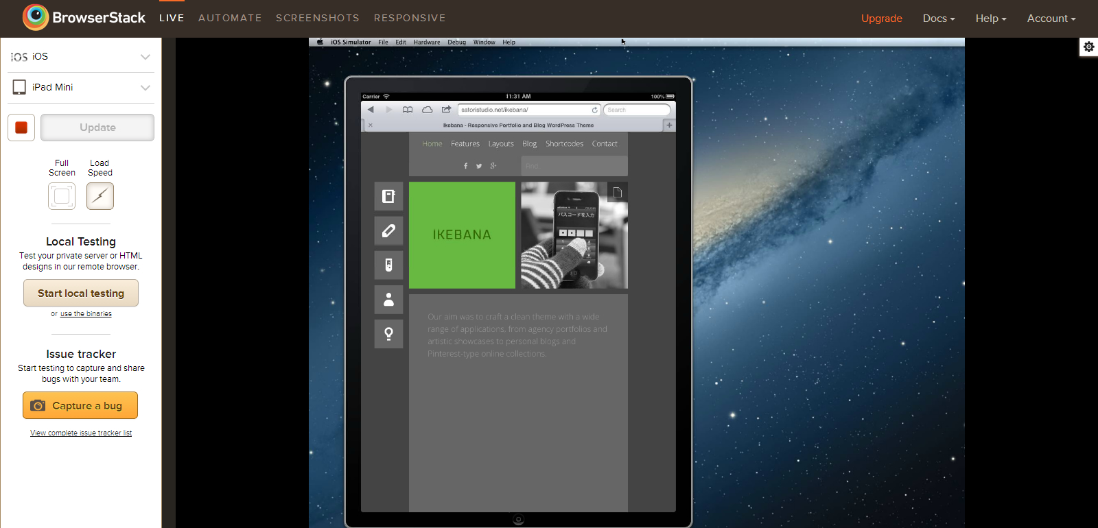
Here is a screenshot of the Ikebana theme on an iPad Mini simulation, in portrait mode (which is the lowest screen width among all existing iPad models, 768px). As you can see, the tiles do fit into the screen and the icon menu on the left is still in the full-screen mode (as is intended by the theme’s media queries).
The content width in Ikebana is determined by an algorithm based on the set width of the standard (1×1) masonry tile. Since the width of every tile is fixed, the content width does not change fluidly with screen width, but rather in “steps”, automatically calculating the optimal content width for a given screen width, so that a non-fractional number of tiles can fit into it. That being said, on some screen widths there will be a gap between the edges of the screen and the content, especially when the width of a 1×1 tile has been set to more than 260px in the “Portfolio page items: box dimensions” setting in the “Portfolio Page” tab of the Theme Options panel; these gaps, however, should collectively be no larger than the width of a single tile plus “safety margins” of 90px, for the reasons I’ve explained above.
Please note that “responsive” does not imply that the website looks exactly identically on all devices – rather, it means that the website automatically adapts to the screen parameters of the viewing device for maximum user friendliness (see e.g. this and this article for more details). The full-width icon menu configuration you’ve mentioned goes into play on screens which are less than 768px in width, i.e. mostly on smaller scmartphones, and has been designed specifically for ease of use on touch-only devices.
That being said, in case you are experiencing problems, I do want to do more than just explaining – I will gladly help you to optimize your website in the way you need. For that, could you please provide the URL of your website, and also indicate which images do not scale with screen width. Thank you!
Sincerely,
Andrii / Satori StudiosatoriKeymasterHey Remotelocation,
first of all, thank you for the purchase!
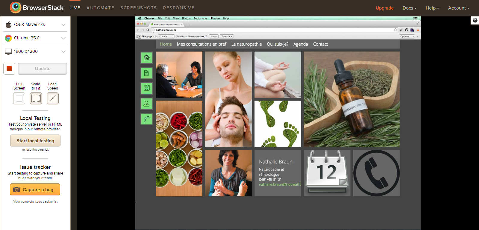
Since this problem hasn’t been reported previously, and since an OSX10.9 Chrome35 emulation in Browserstack seems to be working as intended (see screenshot), I will have to ask you for access to the back-end for further testing and troubleshooting – you can send WP admin credentials to support@satoristudio.net (no disclosure guaranteed). Thanks!
Sincerely,
Andrii / Satori StudiosatoriKeymasterHey Mikosan,
first of all, thank you for the purchase!
Please try creating a new page (“Pages -> Add New”) and give it a “Portfolio” layout from the “Template” drop-down in the “Page Attributes” settings box on the right hand side of the page edit mode screen. Once you save this page, it will display all existing projects (i.e. items that have been created in the “Portfolio -> Add New” admin section).
My apologies if it hasn’t been described in enough details in the theme manual, I will extend that part for the next theme update. Thank you for pointing this out!
Regarding the content importer: this part of the WordPress back-end is not connected with the theme, if you are receiving an error message when trying to import the demo content, it is most probably connected with the settings of the server you are running your WordPress instance on. However, just in case, this is what you can do: go to “Appearance -> Themes”, change the theme to some default one (e.g. “Twenty Fourteen”) and run the importer again. In case it goes smoothly this time, please let me know – I will troubleshoot further.
Should you have additional questions about the theme, do not hesitate to contact me.
Sincerely,
Andrii / Satori StudiosatoriKeymasterHey Oli,
before I ask you for back-end access, could you please try updating your instance of Kanso to version 1.6 (available from the “Downloads” tab of your ThemeForest account) and let me know if the problem still persists? Thanks! You can update a theme by copying over the new theme’s files via ftp.
Sincerely,
Andrii / Satori StudiosatoriKeymasterHey Karen,
glad it helped! You’re right, one the tags needs to be renamed into something else. I will consider changing the name for the portfolio taxonomy into “types” for the next version update of Ikebana.
Sincerely,
Andrii / Satori StudiosatoriKeymasterHey Ajifsk,
I’ve prepared a fix for the iPhone mouseover/mouseclick event issue: please download this archive, unzip it, and upload the resulting files into the theme folder (/wp-content/themes/Ikebana/) via ftp, replacing the existing files when prompted. After that you can refresh the website on your iPhone and test if the mouse events are working properly now. Please let me know if it helps!
Regarding the greyscale tiles: I’ve modified the code, you can get it here. This one will make images greyscale by default and coloured on mouse hover.
Sincerely,
Andrii / Satori StudiosatoriKeymasterHey Ajifsk,
first of all, thank you for the purchase!
I’ve left a reply to your comment on ThemeForest just in case as well, yet will leave a reply here as well so that other forum visitors can see the information.
I will cover your questions in the same order:
1). Yes, there’s a special setting for that in Ikebana, please visit the “Page Elements” tab of the Theme Options panel and input your desired maximum width into the “Maximum content width” field. If you want to force the page to stretch to the max of the available screen with in all cases, you can set this parameter to a high number, e.g. 5000. The default setting is 1500 (pixels).
2). I am not planning to introduce this feature in full into the theme so far, mostly since it is quite specific for a wide-use theme; however, I can provide a piece of code for you that would implement greyscale hover effect on at least 90% of currently used browsers (this is also a more efficient solution, because loading each image in two alternatives would drastically increase the load time of the website, which could negatively impact use experience). Please see the code here.
You can insert this code into the “Style: Add Custom CSS” tab of the Theme Optoions panel (do not forget to press the “Save all changes” button to preserve the effect).
3). Could you please tell me which smartphone you are using to view the website (brand and model, as well as the browser). I will troubleshoot the issue.
Sincerely,
Andrii / Satori StudiosatoriKeymasterHey Luigi,
deal; should you face any issues with the Infinite Scroll or the rest of the theme, do not hesitate to let me know!
Sincerely,
Andrii / Satori StudiosatoriKeymasterHey Vonnagy,
first of all, thank you for the purchase! Glad you’re enjoying the theme.
Regarding your question: to display the background slider as shown on the front page of the Tokyo demo, please make sure that the following conditions are met:
– the “Display custom header” option is ticked on the “Header Elements” tab of the Theme Options panel.
– go to edit mode on the page you wish to show the slider on, and choose “Background Slider” from the drop-down in the “Custom Header” settings box (located below the main content edit area).Let me know if the slider still fails to show after the above manipulations!
Sincerely,
Andrii / Satori Studio -
AuthorPosts