Salient is one of the top-10 ThemeForest best-selling themes of all time, created by an elite author ThemeNectar. First available in April 2013, the theme was a breakthrough in terms of design, giving rise to a plethora of later imitators. Salient has since accumulated 60,000+ happy users and evolved into a full-fledged website building environment, preserving and updating its distinct visual style.
We remember our team’s initial reaction on seeing Salient for the first time: “whoa! Now these guys sure know how to design!”. Cracking it open, we saw clean, rather efficient code, adding to our respect towards the theme’s creators. Salient is distinctly minimalist, but not excessively so; this allows using it to create crisp and clean websites which still retain their individual touch.
The Salient theme is choke-full of features and settings, the most prominent additions of the last years being the internal templating system, which complements the existing drag-and-drop content builder (already a standard in premium WP themes) by allowing to use entire pre-designed page blocks or even entire layouts easily and quickly.
The ThemeNectar team is doing a great job in terms of providing timely and friendly support for the item. During our review we’ve created several “test tickets”, ranging from newbie questions to customization to developer-level inquiries; each was answered within 2 working days (most of them much faster), and none of the underlying issues was left unsolved.
Let’s See What This Baby Can Do
We won’t overwhelm you with dozens of Salient-based websites – instead, let’s look at 7 noteworthy real-life examples of the theme in action, hand-picked by our design and development team:
1. Senz
The creators of the original storm umbrella with the easily recognizable tilt, Senz use Salient for their official website. It makes extensive use of the theme’s WooCommerce compatibility to render and manage a complex online shop.
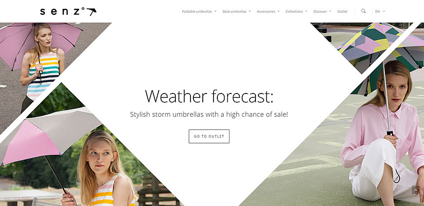
The front page slider is worth a separate mention: it features both beautiful static-image backgrounds as well as animated backgrounds and built-in animations for text elements to make it more dynamic. The front page itself is organized into several blocks using the theme’s visual content builder, ranging from product grids to full-width call-to-action sections, making it anything but boring.
2. Design Garden
This gorgeously-designed website is a learning platform created by Sabina Radeva, an Oxford, UK, based designer and illustrator. Sabina uses the Easy Digital Downloads plugin ecosystem to offer online courses to her Design Garden visitors, which blends in well with Salient.
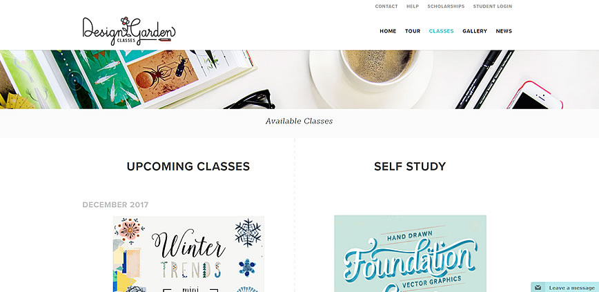
The entire website is sprinkled with Sabina’s lovely illustrations; the theme does not stand in the way, letting the author express her talents while providing that minimalist touch to everything from navigation to the blog feed.
3. Manifesto
Let’s head to Canada and check out Manifesto Festival’s homepage for a change. This annual hip-hop culture event has been brightening Toronto’s youth scene for over a decade, and its unique essence has been successfully captured by the website’s style. Using basic colors (red, black, white), contrasting elements, bold typography and large elements, the page conveys the feeling of authenticity and freedom of expression.
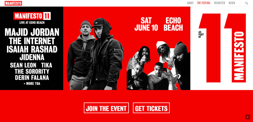
The front page makes use of full-width image grids as well as clever call to action button placement to simultaneously maximize its “wow!” effect and visitor conversions. The previous years’ Manifesto editions are also worth checking out from the top menu, all those pages are also built with Salient’s visual composer.
4. Lion’s Share Digital
The Austin, TX based web design and development agency’s ambitions are reflected in their telling name. The Lion’s Share website is there to express their drive for growth and service excellency. Salient readily offers the necessary elements: large, basic fonts; colourful, full-width sections, plenty of room for imagery.
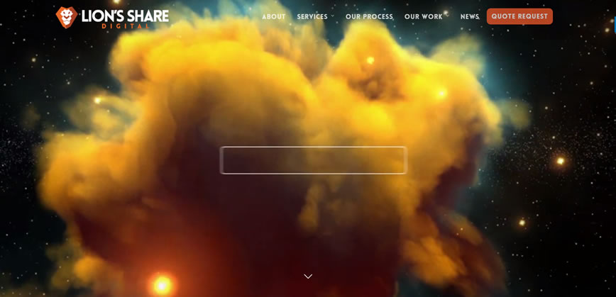
This is a great example of Salient’s full-screen header in action: on entering the website, we are immersed into an epic video presenting the brand. The rest of the page is comprised of visual composer elements tailored to give it a dynamic and colourful vibe.
5. StorNext
If you’re starting to get an impression that Salient is only good for design-focused web pages, think again. Here’s StorNext, a specialized provider of highly distributed file storage system solutions. A good example of a no-nonsense website by IT specialists, for IT specialists:
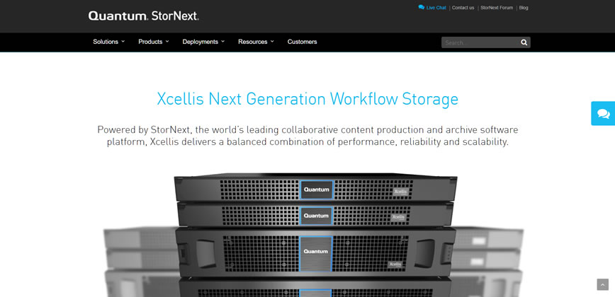
Content is king here, and Salient successfully helps the right things stand out. The website integrates a plethora of plugins, including a client-facing live chat, which works flawlessly with the theme. Another interesting thing to mention here: the StorNext website has been specifically tailored to closely resemble its parent company’s page, quantum.com – showing how easily Salient morphs and flexes to fit any design requirements.
6. Mota
Another high-tech company on our list, Mota is a hardware maker: they produce a range of cool gadgets, focusing on drones and wearables. In this case, Salient needed to support a website with a large and complicated structure, which it handles pretty well with the built-in MegaMenus.
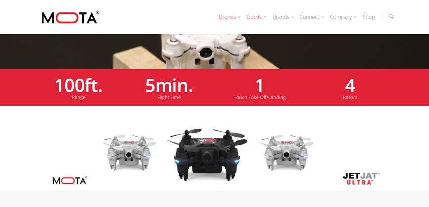
The theme’s visual style fits perfectly with the company’s image: a future-facing manufacturer of highly advanced electronic devices. The individual product pages deserve a special mention: there’s an example of Salient’s custom visual content builder in its full glory; parallaxed images, subtle animations, specs and FAQ sections – all come together to create professional-looking and functional product presentations.
7. Gravual
Last but not least, one of our personal favourites, Gravual, is a tiny design boutique based in Antwerp, Belgium. The entire thing breathes minimalism and style, and scales extra-neatly on smartphone screens thanks to Salient’s smart grids.
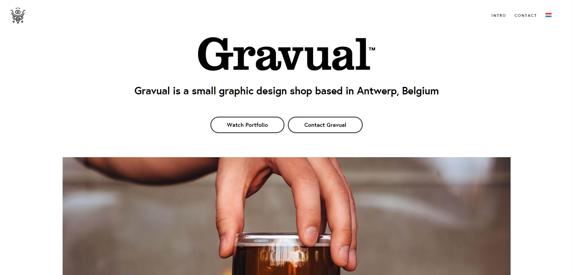
This one’s a good example of Salient’s single-page capabilities: the entire website is essentially presented on the front page, with separate sections branching off where and when needed. The site’s also available in Dutch, showcasing the theme’s multilingual functions.
Your Examples?
Building a website on Salient or know any other noteworthy examples? Drop a line in the comment section below, we’ll consider including it in the list!