New Front EN › Support Forums › Ikebana Theme Support › Responsiveness on ipad
Tagged: ipad, responsive
- This topic has 3 replies, 2 voices, and was last updated 9 years, 9 months ago by
 satori.
-
AuthorPosts
-
July 15, 2014 at 12:25 pm #3745
maartjev
ParticipantHi,
I’m working on a site with the Ikebana theme, with the portfolio on the homepage. However, on the ipad it just shows the icons in a row underneath eachother. Not a few icons horizontally, but only vertically. I want them displayed the way it is on a computerscreen. Otherwise, it is not responsive, is it?
July 15, 2014 at 12:32 pm #3746ParticipantAlso, the content on the ipad, doesn’t fill the complete page. Major white sections on both sides.
July 15, 2014 at 2:50 pm #3747ParticipantAlso: images are not scaled to different screens…not responsive at all!!
July 16, 2014 at 10:28 am #3756satoriKeymasterHey Maartje,
first of all, thank you for the purchase!
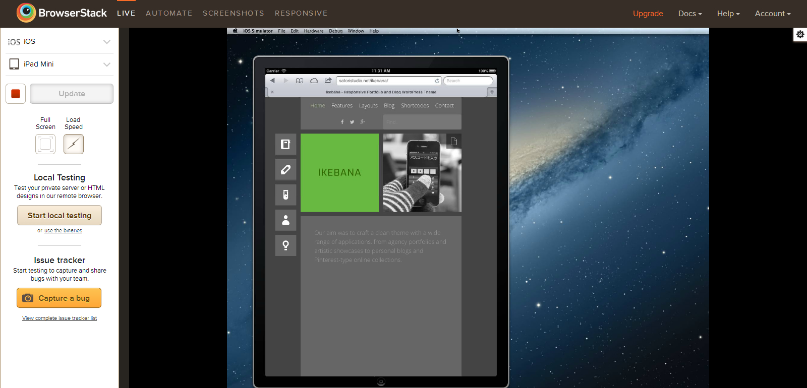
Here is a screenshot of the Ikebana theme on an iPad Mini simulation, in portrait mode (which is the lowest screen width among all existing iPad models, 768px). As you can see, the tiles do fit into the screen and the icon menu on the left is still in the full-screen mode (as is intended by the theme’s media queries).
The content width in Ikebana is determined by an algorithm based on the set width of the standard (1×1) masonry tile. Since the width of every tile is fixed, the content width does not change fluidly with screen width, but rather in “steps”, automatically calculating the optimal content width for a given screen width, so that a non-fractional number of tiles can fit into it. That being said, on some screen widths there will be a gap between the edges of the screen and the content, especially when the width of a 1×1 tile has been set to more than 260px in the “Portfolio page items: box dimensions” setting in the “Portfolio Page” tab of the Theme Options panel; these gaps, however, should collectively be no larger than the width of a single tile plus “safety margins” of 90px, for the reasons I’ve explained above.
Please note that “responsive” does not imply that the website looks exactly identically on all devices – rather, it means that the website automatically adapts to the screen parameters of the viewing device for maximum user friendliness (see e.g. this and this article for more details). The full-width icon menu configuration you’ve mentioned goes into play on screens which are less than 768px in width, i.e. mostly on smaller scmartphones, and has been designed specifically for ease of use on touch-only devices.
That being said, in case you are experiencing problems, I do want to do more than just explaining – I will gladly help you to optimize your website in the way you need. For that, could you please provide the URL of your website, and also indicate which images do not scale with screen width. Thank you!
Sincerely,
Andrii / Satori Studio -
AuthorPosts
- You must be logged in to reply to this topic.